Nitin Jain
← Back
IOT Solutions for the Indian Army
This project involved designing a mission-critical IoT dashboard used by defense personnel to monitor real-time data from field machines and equipment. Due to confidentiality, specific operational details are omitted.
The system supports equipment monitoring, performance tracking, and maintenance readiness in high-stakes, low-margin-for-error environments.
My RoleUX strategy & problem definition
User research & pain point analysis
Information architecture redesign
UI design focused on clarity & reliability
Stakeholder collaboration & iteration


The Problem
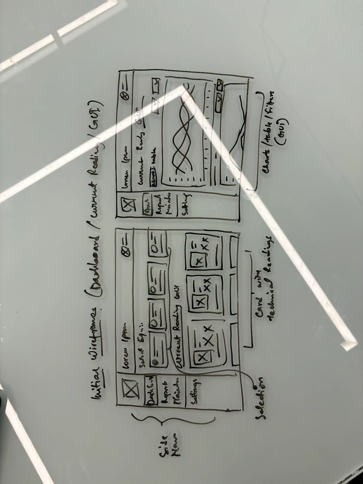
The project began with a PRD and an MVP prototype provided by the client. While the intent was clear, the execution had several critical issues:


No clear navigation structure
Poor information hierarchy with scattered data points
Lack of UX heuristics and visual consistency


High cognitive load in an environment where speed and accuracy are critical
The MVP was functionally ambitious but not usable in real-world defense conditions. My role was to identify these gaps and redesign the system into a reliable, usable, and scalable product.
Solution Approach
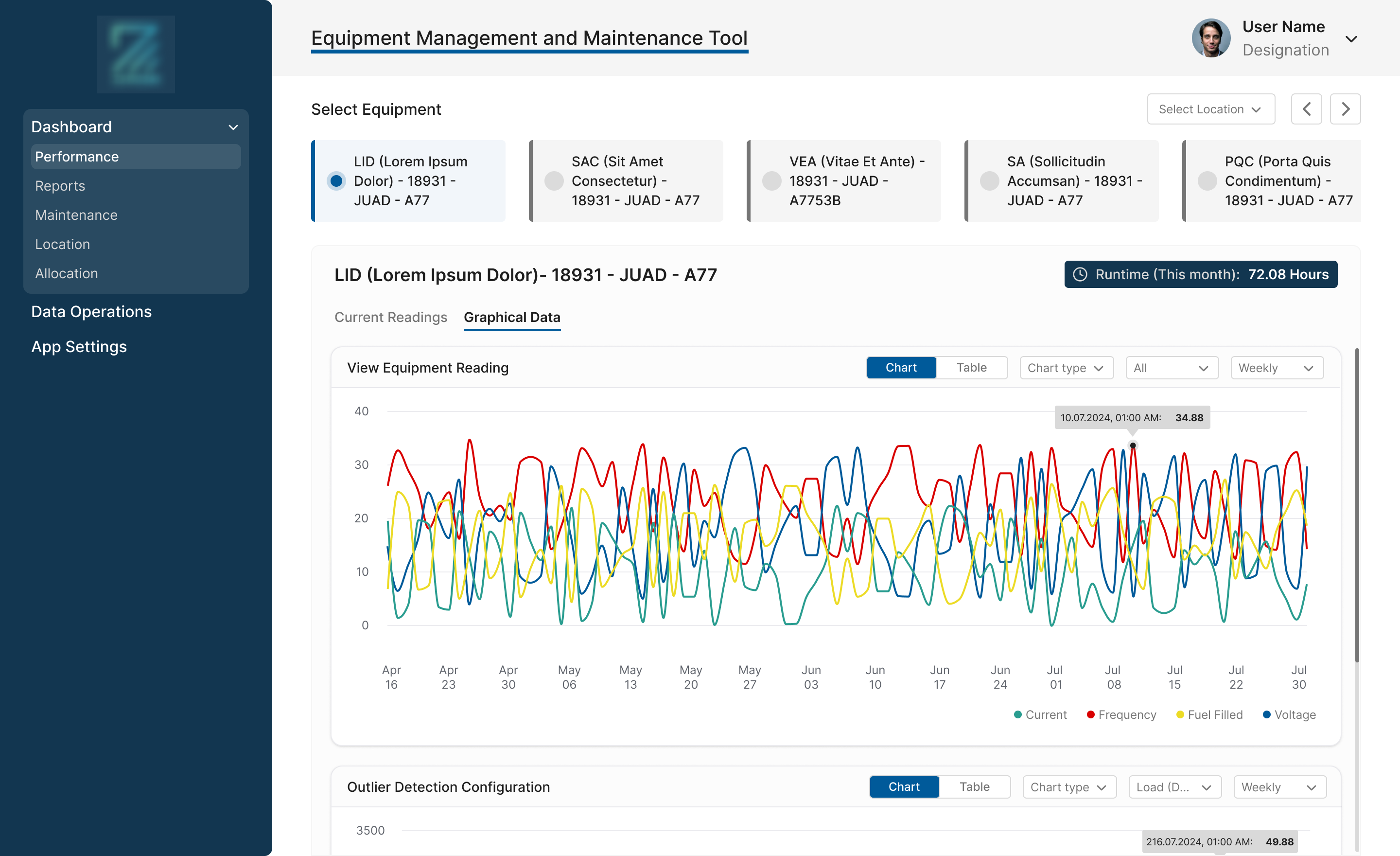
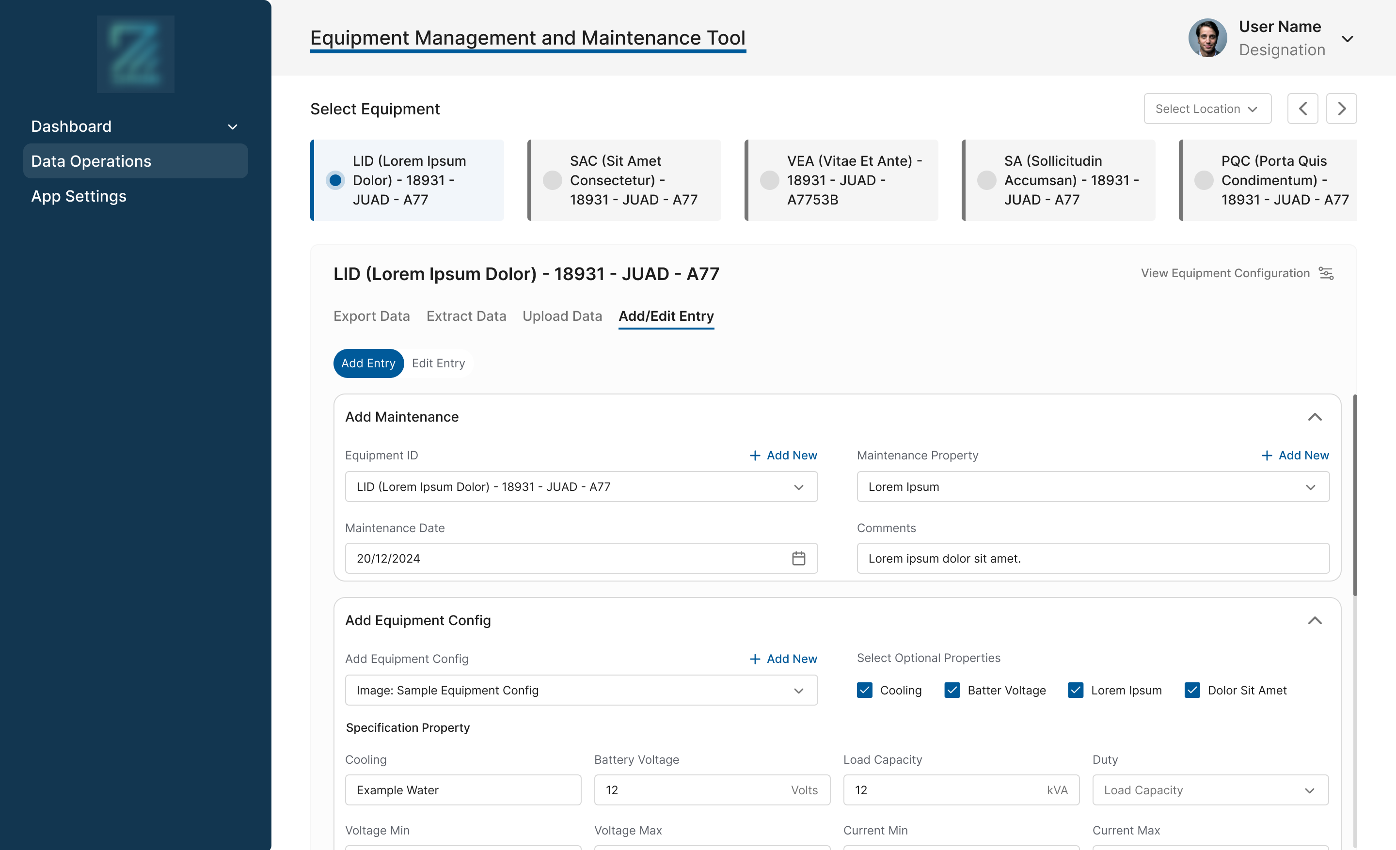
I approached the problem with a design thinking mindset, starting with empathy and deep understanding of the users and their operating environment before touching the UI. The initial MVP lacked clear navigation, UX heuristics, and coherent information hierarchy, with critical data scattered across screens. Through stakeholder discussions and user interviews, I studied how armed forces personnel work in extreme conditions with frequent power cuts, offline machines, and high time pressure. Based on these insights, I restructured the entire information architecture around user intent and operational flow, simplifying complex data into clear, predictable navigation. I iterated closely with stakeholders to validate the structure and finalize the navigation model. The UI was intentionally designed to be simple, highly readable, and unambiguous, with a standard left-panel layout and strong visual hierarchy to minimize cognitive load. Every decision was driven by clarity, reliability, and ease of interpretation in a high-stakes environment where errors are not an option.
Solution Approach
I approached the problem with a design thinking mindset, starting with empathy and deep understanding of the users and their operating environment before touching the UI. The initial MVP lacked clear navigation, UX heuristics, and coherent information hierarchy, with critical data scattered across screens. Through stakeholder discussions and user interviews, I studied how armed forces personnel work in extreme conditions with frequent power cuts, offline machines, and high time pressure. Based on these insights, I restructured the entire information architecture around user intent and operational flow, simplifying complex data into clear, predictable navigation. I iterated closely with stakeholders to validate the structure and finalize the navigation model. The UI was intentionally designed to be simple, highly readable, and unambiguous, with a standard left-panel layout and strong visual hierarchy to minimize cognitive load. Every decision was driven by clarity, reliability, and ease of interpretation in a high-stakes environment where errors are not an option.


No clear navigation structure
Reliable data flow and feedback
No major friction points between users and the interface
High cognitive load in an environment where speed and accuracy are critical
The system successfully transitioned from a confusing MVP into a usable, mission-ready product.

Other Projects


See Project
→


See Project
→


See Project
→

Open to new challenges, let’s connect.


← Back
IOT Solutions for the Indian Army
This project involved designing a mission-critical IoT dashboard used by defense personnel to monitor real-time data from field machines and equipment. Due to confidentiality, specific operational details are omitted.
The system supports equipment monitoring, performance tracking, and maintenance readiness in high-stakes, low-margin-for-error environments.
My RoleUX strategy & problem definition
User research & pain point analysis
Information architecture redesign
UI design focused on clarity & reliability
Stakeholder collaboration & iteration
The Problem
The project began with a PRD and an MVP prototype provided by the client. While the intent was clear, the execution had several critical issues:
No clear navigation structure
Poor information hierarchy with scattered data points
Lack of UX heuristics and visual consistency
High cognitive load in an environment where speed and accuracy are critical
The MVP was functionally ambitious but not usable in real-world defense conditions. My role was to identify these gaps and redesign the system into a reliable, usable, and scalable product.

Solution Approach
I approached the problem with a design thinking mindset, starting with empathy and deep understanding of the users and their operating environment before touching the UI. The initial MVP lacked clear navigation, UX heuristics, and coherent information hierarchy, with critical data scattered across screens. Through stakeholder discussions and user interviews, I studied how armed forces personnel work in extreme conditions with frequent power cuts, offline machines, and high time pressure. Based on these insights, I restructured the entire information architecture around user intent and operational flow, simplifying complex data into clear, predictable navigation. I iterated closely with stakeholders to validate the structure and finalize the navigation model. The UI was intentionally designed to be simple, highly readable, and unambiguous, with a standard left-panel layout and strong visual hierarchy to minimize cognitive load. Every decision was driven by clarity, reliability, and ease of interpretation in a high-stakes environment where errors are not an option.
No clear navigation structure
Reliable data flow and feedback
No major friction points between users and the interface
High cognitive load in an environment where speed and accuracy are critical
The system successfully transitioned from a confusing MVP into a usable, mission-ready product.

Other Projects
See Project
→
See Project
→
See Project
→

Open to new challenges, let’s connect.

← Back
IOT Solutions for the Indian Army
This project involved designing a mission-critical IoT dashboard used by defense personnel to monitor real-time data from field machines and equipment. Due to confidentiality, specific operational details are omitted.
The system supports equipment monitoring, performance tracking, and maintenance readiness in high-stakes, low-margin-for-error environments.
My RoleUX strategy & problem definition
User research & pain point analysis
Information architecture redesign
UI design focused on clarity & reliability
Stakeholder collaboration & iteration
The Problem
The project began with a PRD and an MVP prototype provided by the client. While the intent was clear, the execution had several critical issues:
No clear navigation structure
Poor information hierarchy with scattered data points
Lack of UX heuristics and visual consistency
High cognitive load in an environment where speed and accuracy are critical
The MVP was functionally ambitious but not usable in real-world defense conditions. My role was to identify these gaps and redesign the system into a reliable, usable, and scalable product.
Diagnosis Before Design
Before designing, I focused on understanding the users and their operating environment. The system will be used by armed forces personnel working in extreme conditions with frequent power cuts, offline machines, and high time pressure. Through stakeholder discussions and user interviews, I identified challenges around locating critical information, unclear alert prioritization, and confusing navigation. These issues increased cognitive load and risk of human error.This wasn’t a UI problem, it was a clarity and system design problem.
Solution Approach
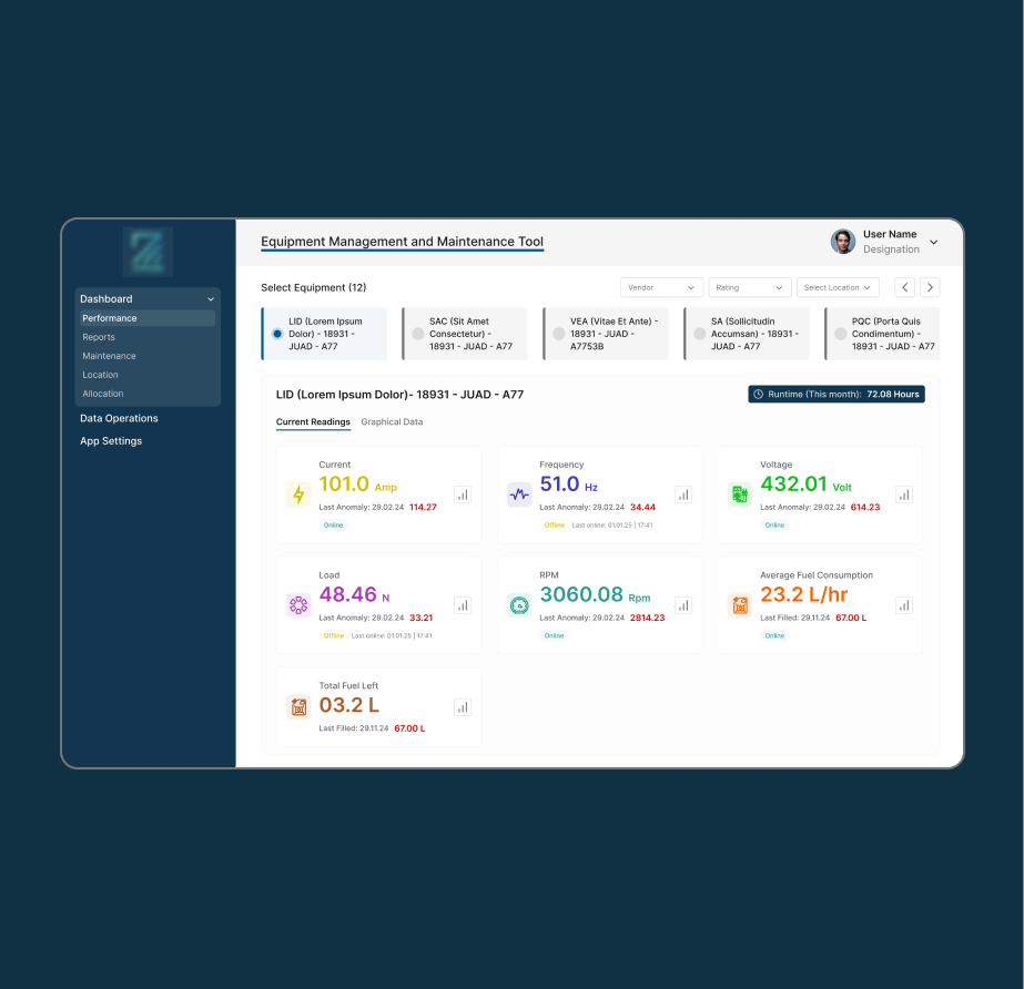
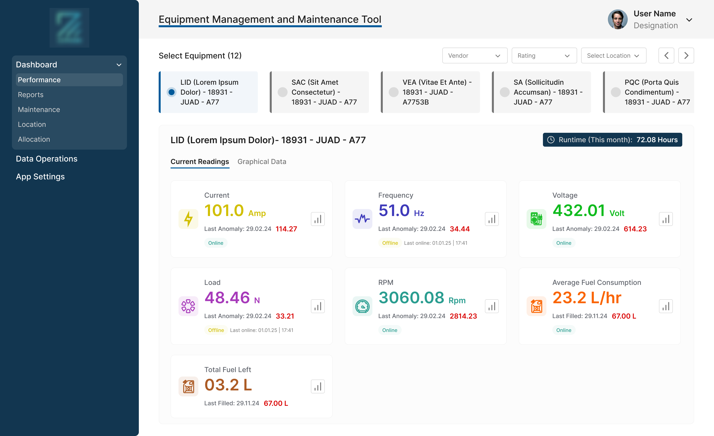
I approached the problem with a design thinking mindset, starting with empathy and understanding the users and their operating environment before touching the UI. The initial MVP lacked clear navigation, UX heuristics, and coherent information hierarchy, with critical data scattered across screens. Through stakeholder discussions and user interviews, I studied how armed forces personnel operate in extreme conditions with frequent power cuts, offline machines, and high time pressure. Based on these insights, I restructured the information architecture around user intent and operational flow. I iterated closely with stakeholders to validate and finalize a clear, predictable navigation model. The UI was designed to be simple, highly readable, and unambiguous to minimize cognitive load in high-stakes scenarios.
The Outcome
Due to the sensitive nature of the project, direct user feedback from armed forces personnel was not accessible. However, post-integration feedback from stakeholders highlighted:
Smooth integration with multiple machines
Reliable data flow and feedback
No major friction points between users and the interface
Easy onboarding and fast adoption by users which led to Improved confidence in monitoring and maintenance workflows
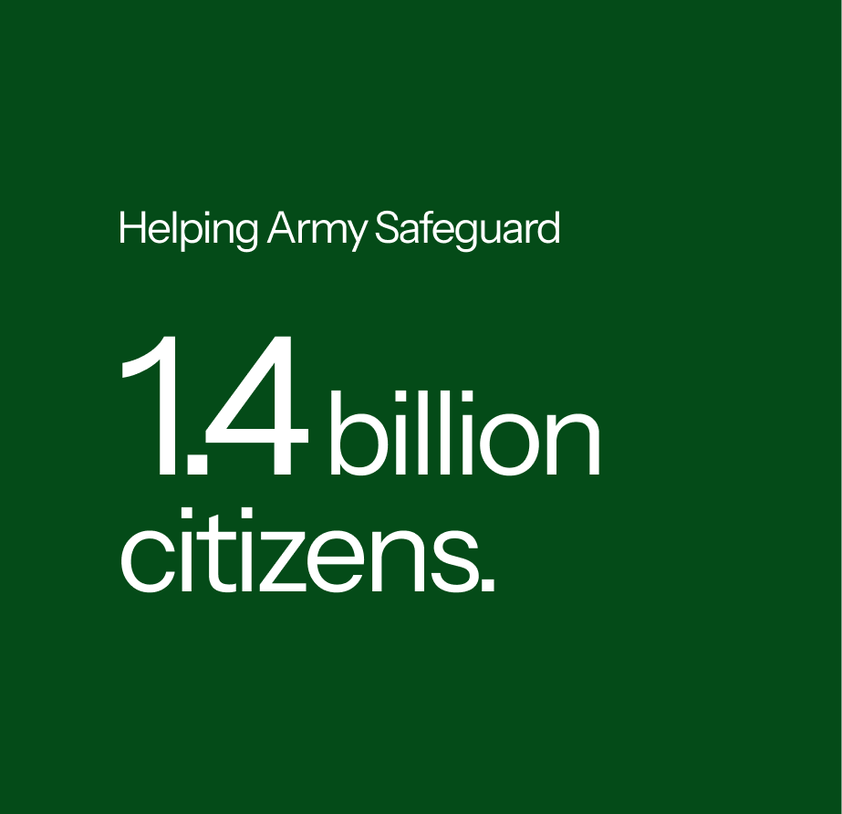
The system successfully transitioned from a confusing MVP into a usable, mission-ready product, safeguarding our country, indirectly impacting 1.4 billion citizens.

Other Projects
See Project
→
See Project
→
See Project
→

Open to new challenges, let’s connect.
