

back
Took a Legacy App into delightful UX for 100K Users
(Product strategy, Stakeholder Collaboration, UX research, Interaction Design)
Overview

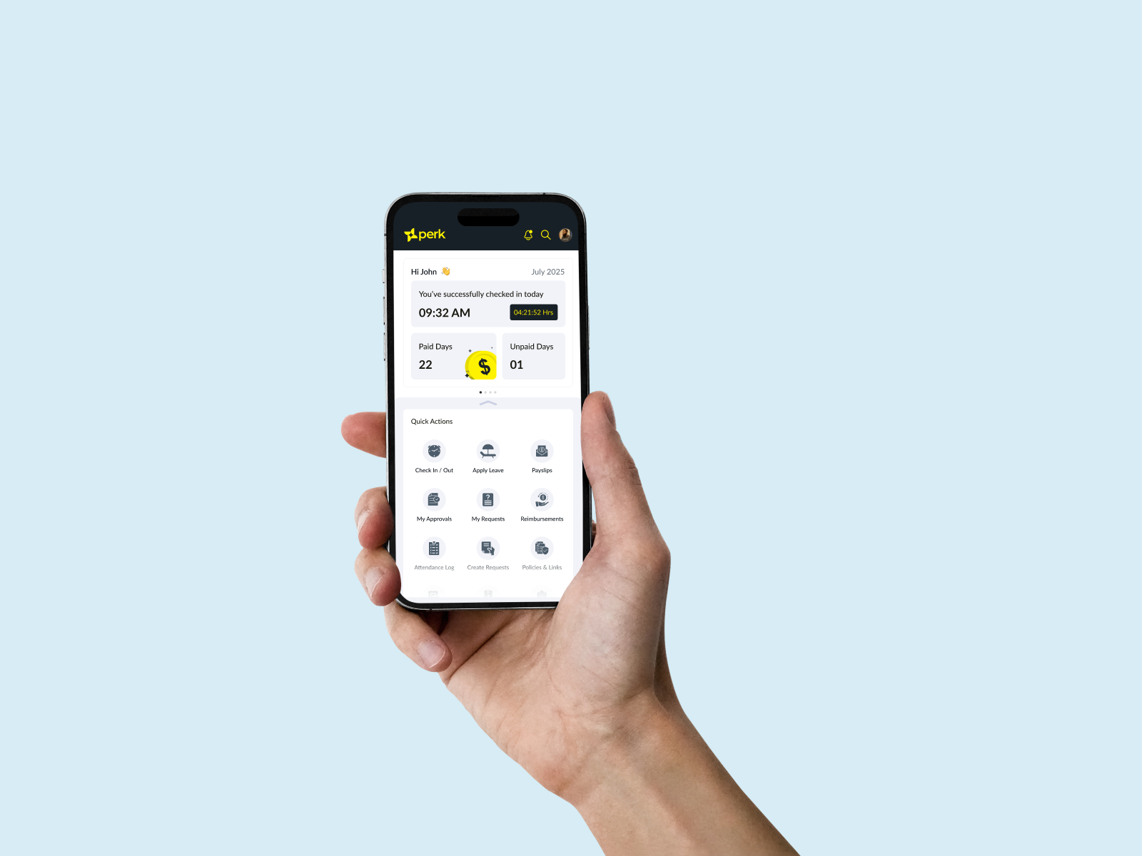
Launched an employee mobile app used by 1,00,000+ daily users, transforming a developer-built MVP into a scalable product experience. Led stakeholder alignment, user research, feature discovery, and end-to-end UX delivery, resulting in significantly improved performance, higher engagement, and a much stronger business impact.
The Challenge

The design problem was obvious, but the bigger challenge was organizational.
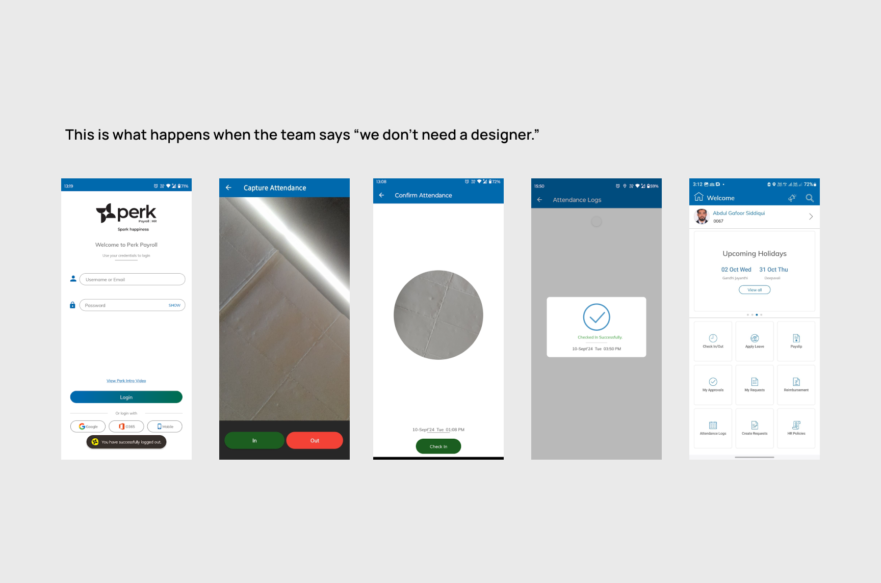
The existing app had evolved from developer-led wireframes pushed into production, creating significant usability debt across the experience. Despite customer facing teams hearing complaints about the mobile experience, redesigning it was not initially seen as a business priority. Before solving the UX problem, I first had to build the business case for why mobile experience mattered, not just to users, but to overall product perception and growth.
Stakeholder Alignment

Convincing stakeholders to rethink the app was the first major milestone.
To make the case, I used competitor benchmarking, direct insights from sales and customer support teams, and evidence that customers increasingly judged the overall product quality through its mobile experience. The conversation gradually shifted from “the app works” to “the app reflects our product maturity.” Approval took time, but fundamentally changed how they viewed mobile.
Technology as a Product Constraint

Once redesign discussions began, a deeper issue surfaced. The technology stack itself was limiting the future of the product.
The existing app was built on MAUI, which served its purpose during early stage product development, but introduced scaling limitations for a mature multi platform application. Through discussions with the development lead, we identified React Native as a more practical long term architecture because it enabled scalable development across both Android and iOS. This required another round of stakeholder alignment, but making the right platform decision upfront ensured UX ambition would not be constrained later.
Research and Product Discovery

With approvals in place, the focus shifted from redesigning assumptions to understanding actual user behavior.
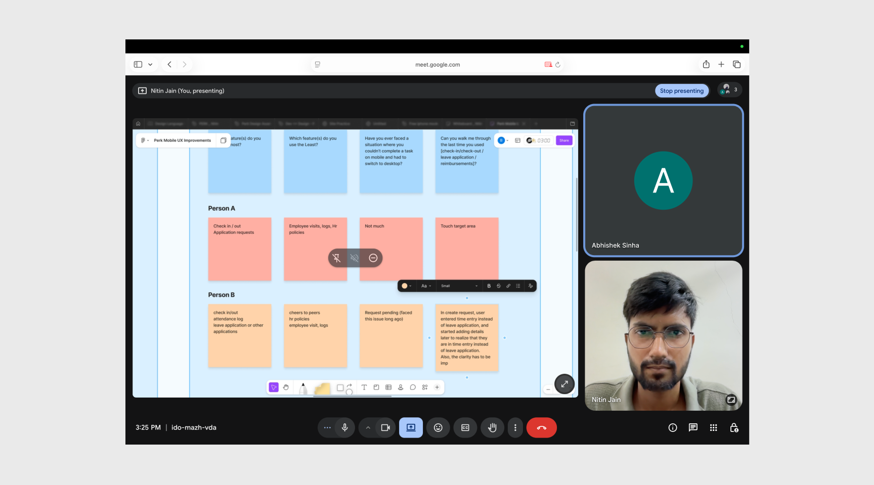
I conducted user interviews to uncover usage patterns, motivations, friction points, and unmet expectations from the mobile experience. The research revealed that users were not just struggling with usability, they also expected workflows and capabilities that simply did not exist in the current app. This changed the scope from a redesign exercise into a broader product discovery initiative.
Working closely with the Product Manager, I translated these findings into product requirements, co-created PRDs, mapped information architecture, and defined core user flows before moving into interface design.
Reframing the Problem

The challenge was no longer about making the app look modern.
It became a much bigger product question: how do we create a scalable mobile experience that aligns with user expectations, engineering feasibility, and business growth?
That shift changed every design decision that followed.
Solution

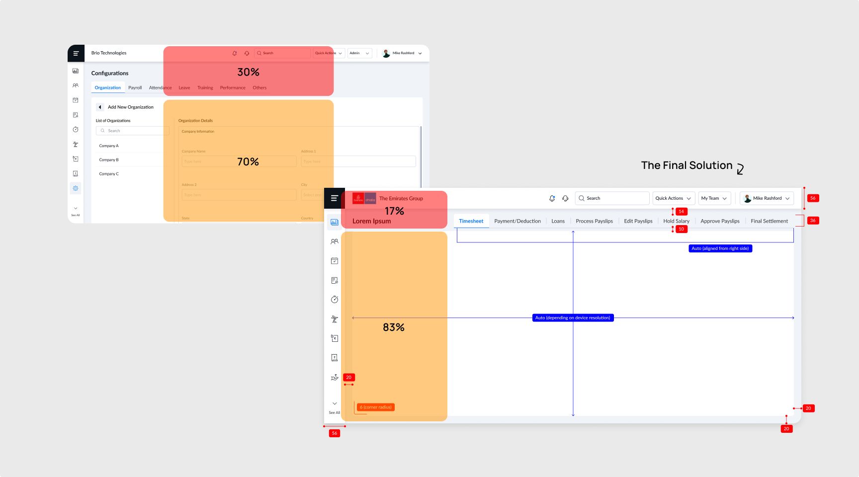
Before moving into final design, I validated early workflows with both users and the engineering team to assess desirability and technical feasibility in parallel. This helped avoid costly rework and allowed the PM and me to prepare more realistic effort estimates before development began.
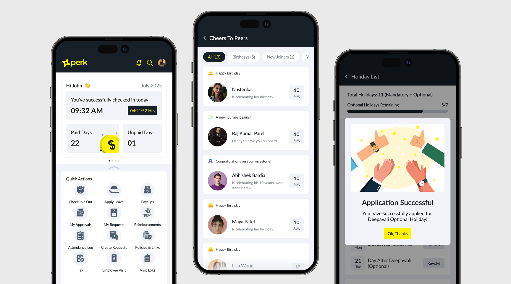
Once requirements were approved, I designed the primary flows with a strong focus on usability, clarity, and interaction efficiency, balancing modern mobile patterns with the practical realities of enterprise usage.
Mistakes, Corrections and Collaborations

I did make a few misjudgments, but the advantage of working iteratively was catching them early.
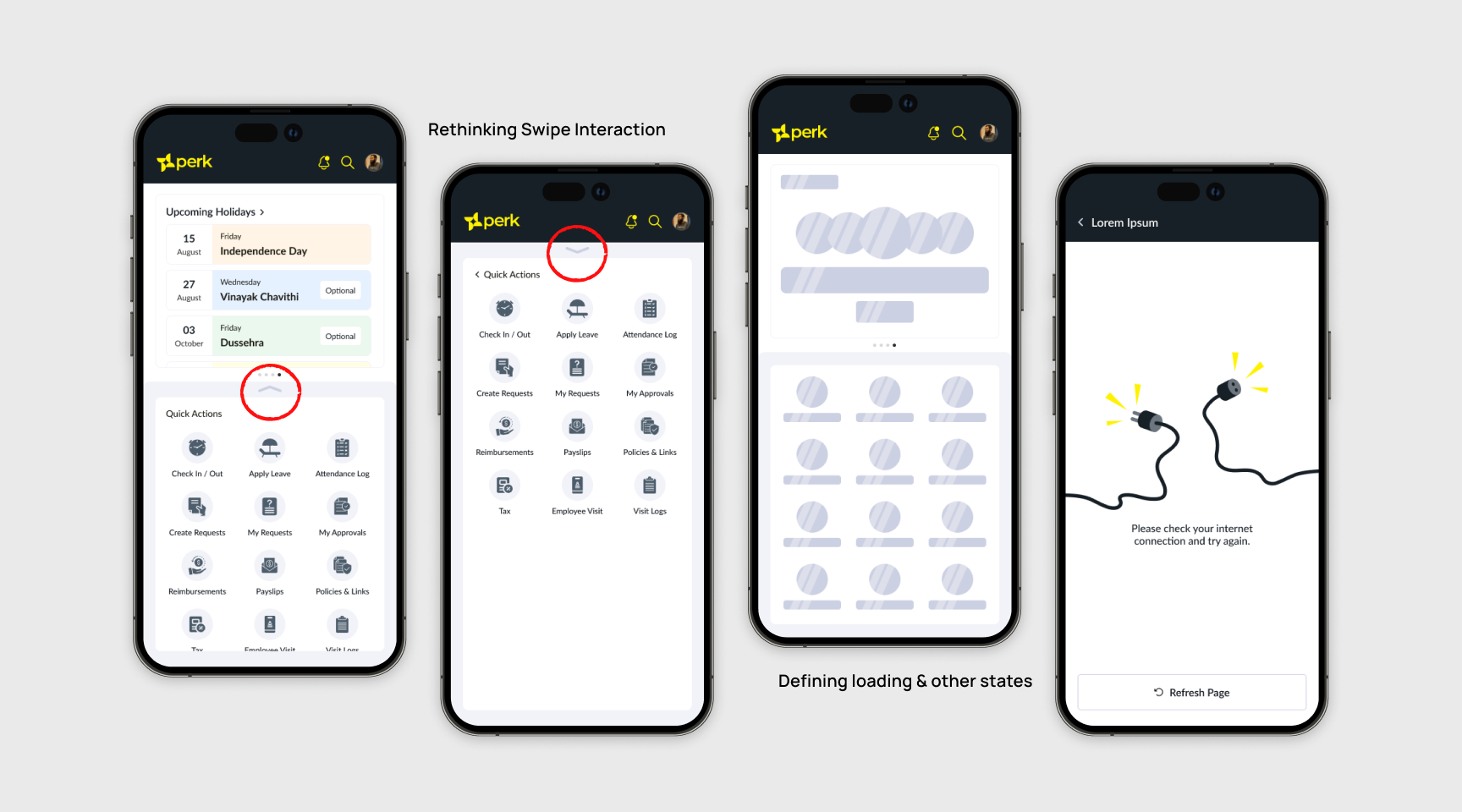
A few interaction states and edge-case scenarios were initially missed during design, which surfaced during sprint execution. Since the team was already working in agile cycles, these gaps were quickly identified and resolved in subsequent sprints without impacting launch momentum.
There were also moments of pushback from engineering around certain interactions. Instead of forcing design intent, we worked collaboratively to understand implementation constraints, simplify where necessary, and preserve the overall experience without creating avoidable engineering overhead.
Deep Dive: Kiosk Attendance

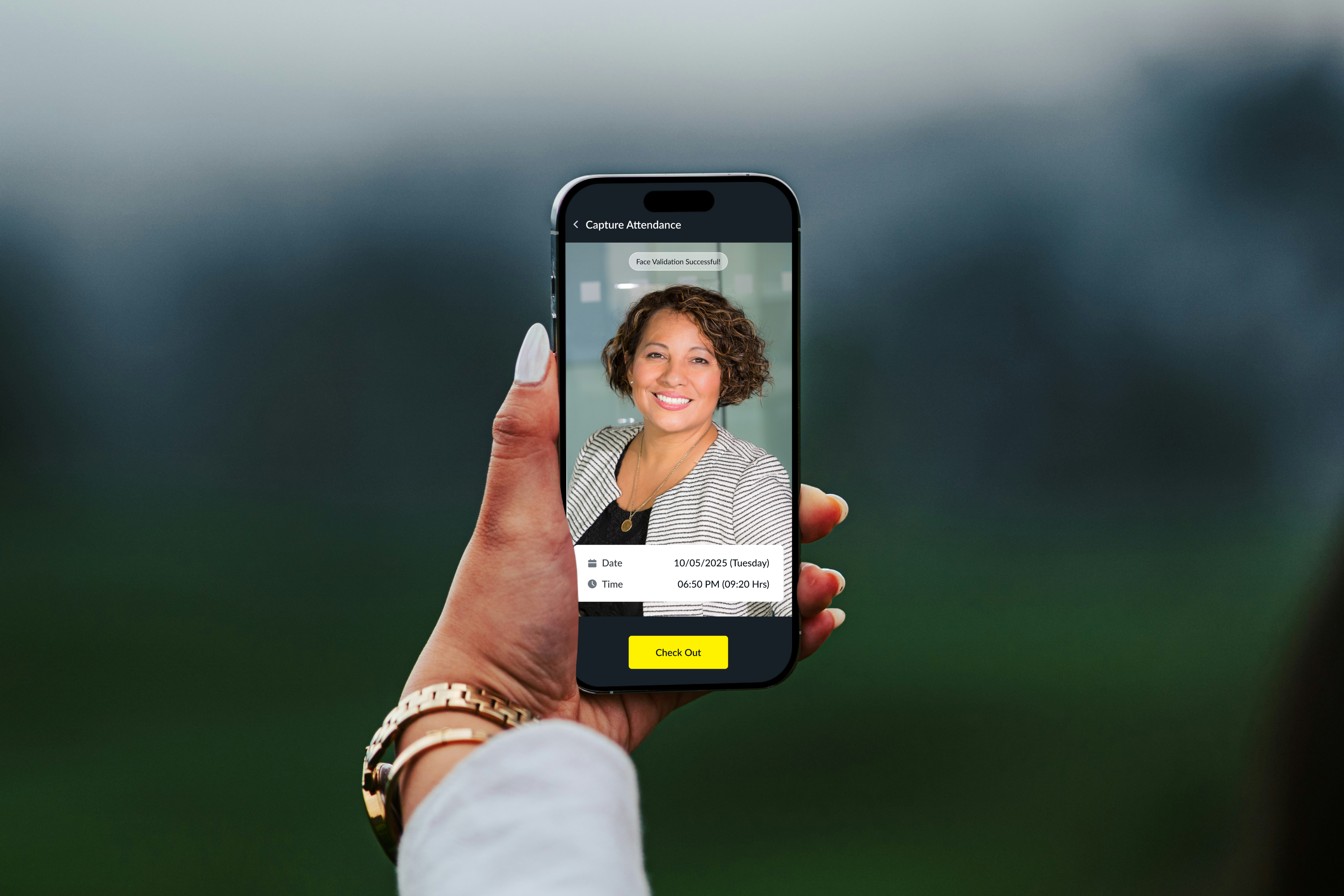
One of the more interesting challenges was designing a kiosk based attendance experience for blue collar workers, which was one of the new requirements we uncovered from user interviews.
Unlike regular app users, kiosk interactions needed to be fast, intuitive, and operable with minimal digital literacy. I studied attendance centric applications, spoke with a real security guard who would be monitoring and assisting workers during check-in, and tested the experience in realistic conditions.
I also explored auditory confirmation patterns inspired by payment apps, using sound psychology to create immediate reassurance for successful check-in and check-out actions, reducing ambiguity in high frequency usage scenarios.
The Impact

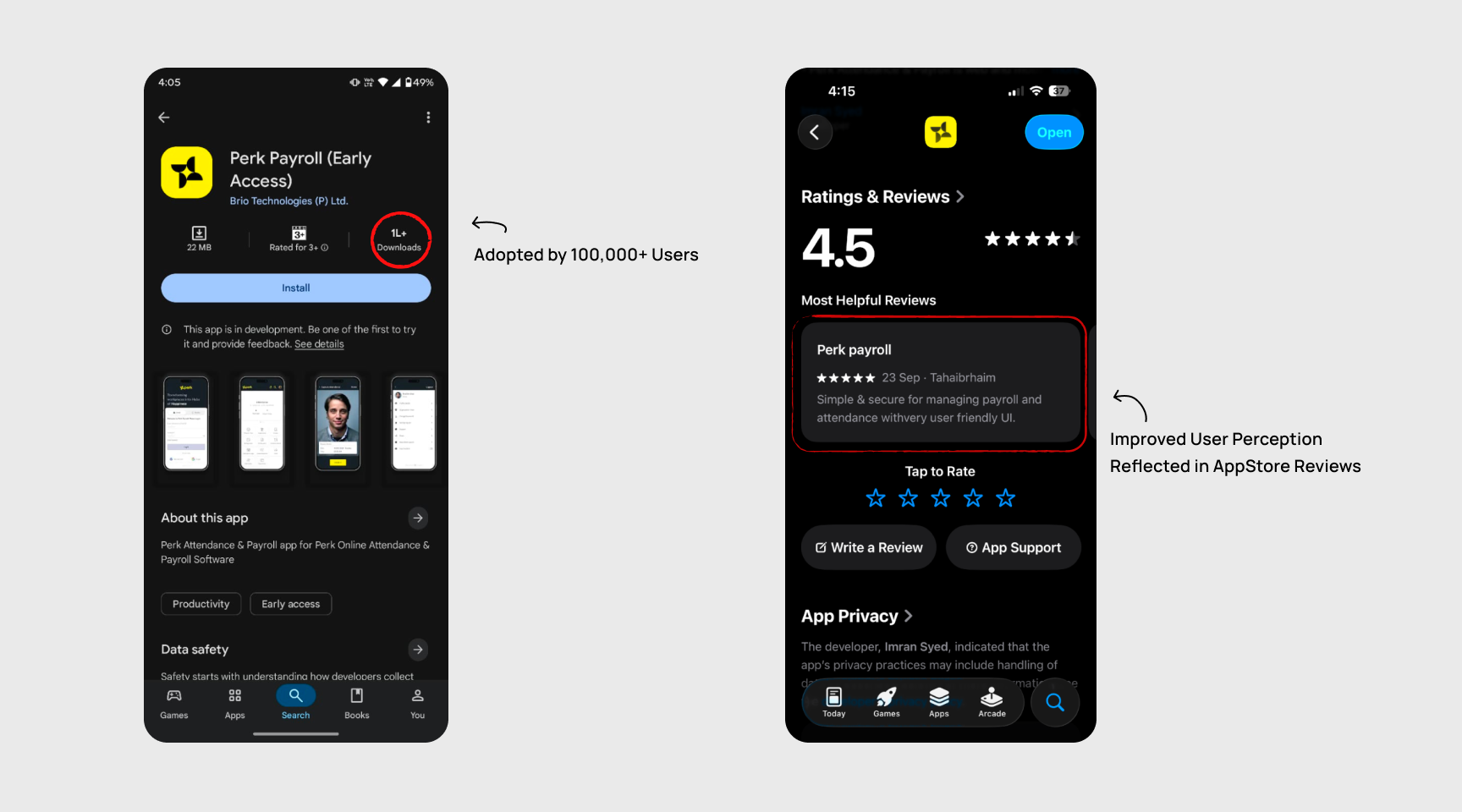
Led the end-to-end transformation of an employee mobile app used by 1,00,000+ daily users, evolving it from a fragmented MVP into a scalable, modern product experience. Beyond redesigning the UX, this involved stakeholder alignment, influencing a platform migration from MAUI to React Native, user research, feature discovery, and iterative delivery. The relaunch resulted in nearly 100% performance improvement, a 50% increase in employee engagement within 3 months, and turned the app into a stronger product asset for sales and customer conversations.
What I Learnt

This project expanded my role far beyond just design.
I learned how to influence stakeholders when the problem is not immediately obvious, how deeply technical constraints shape product decisions, and how important it is to design differently for very different user groups, from office employees to blue-collar kiosk users.
It also sharpened my judgment around synthesis. Users will ask for many things, but strong product design comes from identifying underlying needs, filtering noise, and shaping a coherent experience rather than building every request literally.
Open to new challenges, let’s connect.


Took a Legacy App into delightful UX for 100K Users
(Product strategy, Stakeholder Collaboration, UX research, Interaction Design)
Overview

Launched an employee mobile app used by 1,00,000+ daily users, transforming a developer-built MVP into a scalable product experience. Led stakeholder alignment, user research, feature discovery, and end-to-end UX delivery, resulting in significantly improved performance, higher engagement, and a much stronger business impact.
The Challenge

The design problem was obvious, but the bigger challenge was organizational.
The existing app had evolved from developer-led wireframes pushed into production, creating significant usability debt across the experience. Despite customer facing teams hearing complaints about the mobile experience, redesigning it was not initially seen as a business priority. Before solving the UX problem, I first had to build the business case for why mobile experience mattered, not just to users, but to overall product perception and growth.
Stakeholder Alignment

Convincing stakeholders to rethink the app was the first major milestone.
To make the case, I used competitor benchmarking, direct insights from sales and customer support teams, and evidence that customers increasingly judged the overall product quality through its mobile experience. The conversation gradually shifted from “the app works” to “the app reflects our product maturity.” Approval took time, but fundamentally changed how they viewed mobile.
Technology as a Product Constraint

Once redesign discussions began, a deeper issue surfaced. The technology stack itself was limiting the future of the product.
The existing app was built on MAUI, which served its purpose during early stage product development, but introduced scaling limitations for a mature multi platform application. Through discussions with the development lead, we identified React Native as a more practical long term architecture because it enabled scalable development across both Android and iOS. This required another round of stakeholder alignment, but making the right platform decision upfront ensured UX ambition would not be constrained later.
Research and Product Discovery

With approvals in place, the focus shifted from redesigning assumptions to understanding actual user behavior.
I conducted user interviews to uncover usage patterns, motivations, friction points, and unmet expectations from the mobile experience. The research revealed that users were not just struggling with usability, they also expected workflows and capabilities that simply did not exist in the current app. This changed the scope from a redesign exercise into a broader product discovery initiative.
Working closely with the Product Manager, I translated these findings into product requirements, co-created PRDs, mapped information architecture, and defined core user flows before moving into interface design.
Reframing the Problem

The challenge was no longer about making the app look modern.
It became a much bigger product question: how do we create a scalable mobile experience that aligns with user expectations, engineering feasibility, and business growth?
That shift changed every design decision that followed.
Solution

Before moving into final design, I validated early workflows with both users and the engineering team to assess desirability and technical feasibility in parallel. This helped avoid costly rework and allowed the PM and me to prepare more realistic effort estimates before development began.
Once requirements were approved, I designed the primary flows with a strong focus on usability, clarity, and interaction efficiency, balancing modern mobile patterns with the practical realities of enterprise usage.
Mistakes, Corrections and Collaborations

I did make a few misjudgments, but the advantage of working iteratively was catching them early.
A few interaction states and edge-case scenarios were initially missed during design, which surfaced during sprint execution. Since the team was already working in agile cycles, these gaps were quickly identified and resolved in subsequent sprints without impacting launch momentum.
There were also moments of pushback from engineering around certain interactions. Instead of forcing design intent, we worked collaboratively to understand implementation constraints, simplify where necessary, and preserve the overall experience without creating avoidable engineering overhead.
Deep Dive: Kiosk Attendance

One of the more interesting challenges was designing a kiosk based attendance experience for blue collar workers, which was one of the new requirements we uncovered from user interviews.
Unlike regular app users, kiosk interactions needed to be fast, intuitive, and operable with minimal digital literacy. I studied attendance centric applications, spoke with a real security guard who would be monitoring and assisting workers during check-in, and tested the experience in realistic conditions.
I also explored auditory confirmation patterns inspired by payment apps, using sound psychology to create immediate reassurance for successful check-in and check-out actions, reducing ambiguity in high frequency usage scenarios.
The Impact

Led the end-to-end transformation of an employee mobile app used by 1,00,000+ daily users, evolving it from a fragmented MVP into a scalable, modern product experience. Beyond redesigning the UX, this involved stakeholder alignment, influencing a platform migration from MAUI to React Native, user research, feature discovery, and iterative delivery. The relaunch resulted in nearly 100% performance improvement, a 50% increase in employee engagement within 3 months, and turned the app into a stronger product asset for sales and customer conversations.
What I Learnt

This project expanded my role far beyond just design.
I learned how to influence stakeholders when the problem is not immediately obvious, how deeply technical constraints shape product decisions, and how important it is to design differently for very different user groups, from office employees to blue-collar kiosk users.
It also sharpened my judgment around synthesis. Users will ask for many things, but strong product design comes from identifying underlying needs, filtering noise, and shaping a coherent experience rather than building every request literally.
Open to new challenges, let’s connect.

Overview
Challenge
Alignment
Constraint
Research
Reframe
Solution
Mistakes
Deep Dive
The Impact
What I Learnt

Took a Legacy App into delightful UX for 100K Users
(Product strategy, Stakeholder Collaboration, UX research, Interaction Design)
Overview

Launched an employee mobile app used by 1,00,000+ daily users, transforming a developer-built MVP into a scalable product experience. Led stakeholder alignment, user research, feature discovery, and end-to-end UX delivery, resulting in significantly improved performance, higher engagement, and a much stronger business impact.
The Challenge

The design problem was obvious, but the bigger challenge was organizational.
The existing app had evolved from developer-led wireframes pushed into production, creating significant usability debt across the experience. Despite customer facing teams hearing complaints about the mobile experience, redesigning it was not initially seen as a business priority. Before solving the UX problem, I first had to build the business case for why mobile experience mattered, not just to users, but to overall product perception and growth.
Stakeholder Alignment

Convincing stakeholders to rethink the app was the first major milestone.
To make the case, I used competitor benchmarking, direct insights from sales and customer support teams, and evidence that customers increasingly judged the overall product quality through its mobile experience. The conversation gradually shifted from “the app works” to “the app reflects our product maturity.” Approval took time, but fundamentally changed how they viewed mobile.
Technology as a Product Constraint

Once redesign discussions began, a deeper issue surfaced. The technology stack itself was limiting the future of the product.
The existing app was built on MAUI, which served its purpose during early stage product development, but introduced scaling limitations for a mature multi platform application. Through discussions with the development lead, we identified React Native as a more practical long term architecture because it enabled scalable development across both Android and iOS. This required another round of stakeholder alignment, but making the right platform decision upfront ensured UX ambition would not be constrained later.
Research and Product Discovery

With approvals in place, the focus shifted from redesigning assumptions to understanding actual user behavior.
I conducted user interviews to uncover usage patterns, motivations, friction points, and unmet expectations from the mobile experience. The research revealed that users were not just struggling with usability, they also expected workflows and capabilities that simply did not exist in the current app. This changed the scope from a redesign exercise into a broader product discovery initiative.
Working closely with the Product Manager, I translated these findings into product requirements, co-created PRDs, mapped information architecture, and defined core user flows before moving into interface design.
Reframing the Problem

The challenge was no longer about making the app look modern.
It became a much bigger product question: how do we create a scalable mobile experience that aligns with user expectations, engineering feasibility, and business growth?
That shift changed every design decision that followed.
Solution

Before moving into final design, I validated early workflows with both users and the engineering team to assess desirability and technical feasibility in parallel. This helped avoid costly rework and allowed the PM and me to prepare more realistic effort estimates before development began.
Once requirements were approved, I designed the primary flows with a strong focus on usability, clarity, and interaction efficiency, balancing modern mobile patterns with the practical realities of enterprise usage.
Mistakes, Corrections and Collaborations

I did make a few misjudgments, but the advantage of working iteratively was catching them early.
A few interaction states and edge-case scenarios were initially missed during design, which surfaced during sprint execution. Since the team was already working in agile cycles, these gaps were quickly identified and resolved in subsequent sprints without impacting launch momentum.
There were also moments of pushback from engineering around certain interactions. Instead of forcing design intent, we worked collaboratively to understand implementation constraints, simplify where necessary, and preserve the overall experience without creating avoidable engineering overhead.
Deep Dive: Kiosk Attendance

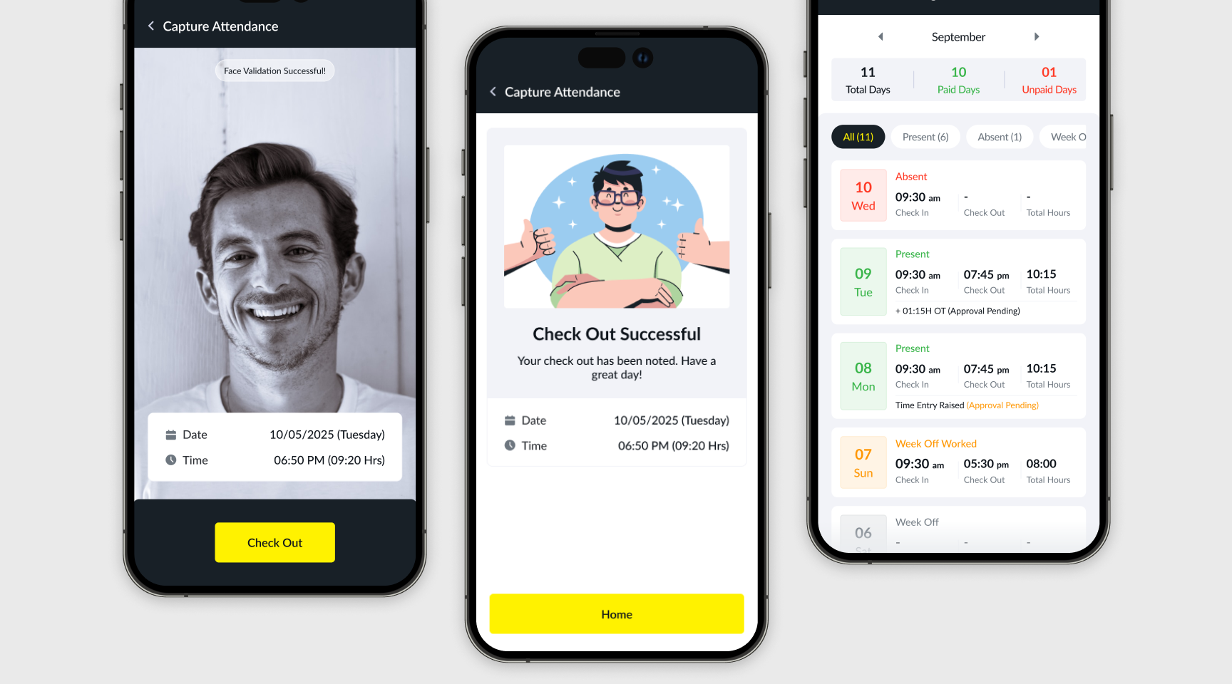
One of the more interesting challenges was designing a kiosk based attendance experience for blue collar workers, which was one of the new requirements we uncovered from user interviews.
Unlike regular app users, kiosk interactions needed to be fast, intuitive, and operable with minimal digital literacy. I studied attendance centric applications, spoke with a real security guard who would be monitoring and assisting workers during check-in, and tested the experience in realistic conditions.
I also explored auditory confirmation patterns inspired by payment apps, using sound psychology to create immediate reassurance for successful check-in and check-out actions, reducing ambiguity in high frequency usage scenarios.
The Impact

Led the end-to-end transformation of an employee mobile app used by 1,00,000+ daily users, evolving it from a fragmented MVP into a scalable, modern product experience. Beyond redesigning the UX, this involved stakeholder alignment, influencing a platform migration from MAUI to React Native, user research, feature discovery, and iterative delivery. The relaunch resulted in nearly 100% performance improvement, a 50% increase in employee engagement within 3 months, and turned the app into a stronger product asset for sales and customer conversations.
What I Learnt

This project expanded my role far beyond just design.
I learned how to influence stakeholders when the problem is not immediately obvious, how deeply technical constraints shape product decisions, and how important it is to design differently for very different user groups, from office employees to blue-collar kiosk users.
It also sharpened my judgment around synthesis. Users will ask for many things, but strong product design comes from identifying underlying needs, filtering noise, and shaping a coherent experience rather than building every request literally.
Open to new challenges, let’s connect.


