

back
Transformed a Broken Experience into a Scalable HRMS
(Design System, Information Architecture, System Thinking, Primary & Secondary Research)
Overview

Most products fail loudly. This one didn’t.
Perk HRMS had features. It had clients. It worked. But underneath, something was off, users struggled to complete basic tasks, support tickets kept rising, and teams relied more on workarounds than the product itself.
That’s where I stepped in.
Context

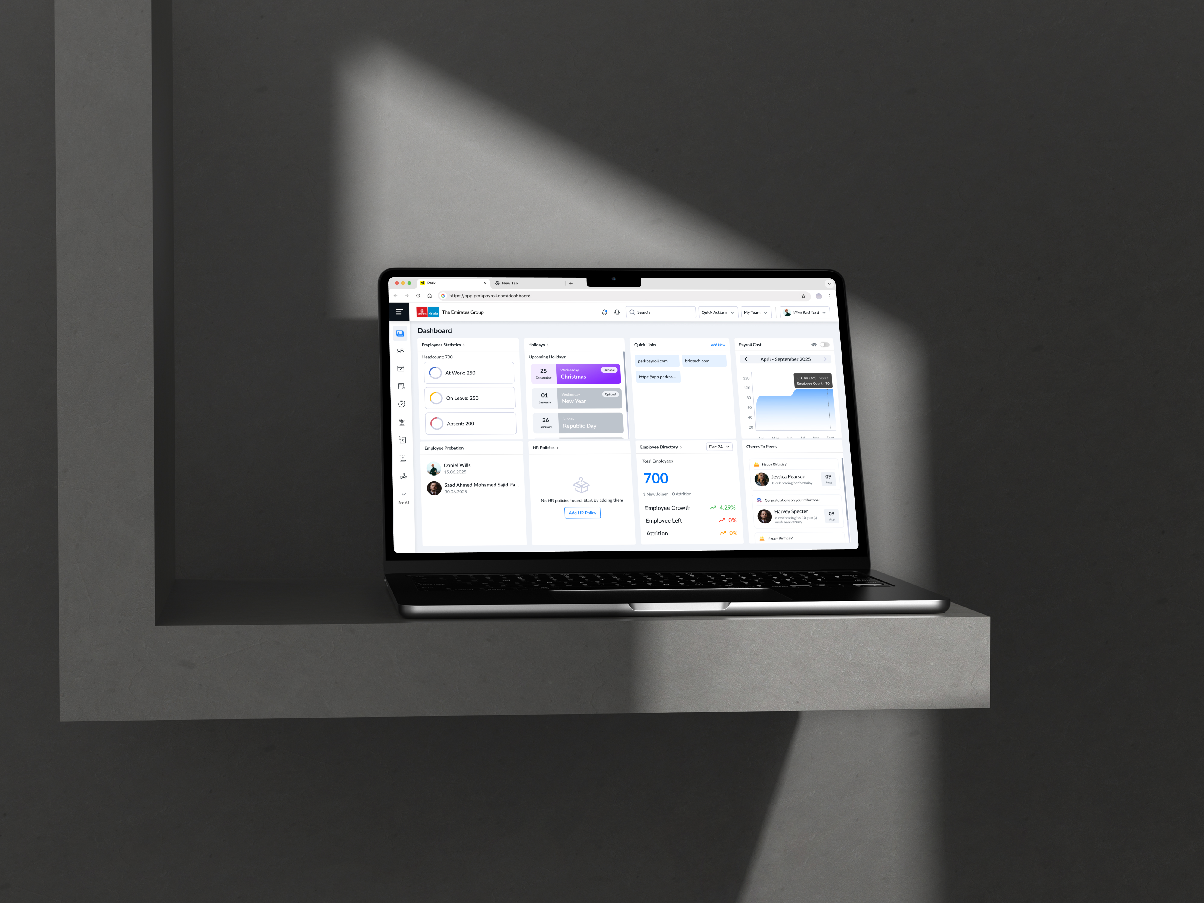
I joined as the senior product designer on an HRMS platform used by multiple organizations to manage attendance, payroll, requests, and employee workflows.
On paper, the product was solid. In reality, it was functionally complete but experientially broken. Inconsistent UI, unpredictable flows, poor scalability and a lot of fiction points.
Diagnosis

The issues didn’t surface as isolated complaints. They showed up as patterns over time. HRs were taking longer to complete routine tasks, managers were avoiding certain workflows altogether, and employees depended heavily on HR instead of using the system independently.
Internally, support tickets were increasing, and each module behaved differently, creating confusion rather than clarity. It became evident that this wasn’t a UI issue—it was a deeper system failure.
Research

I conducted an agile UX audit across the product. I evaluated workflows, interaction patterns, and system consistency to understand what was actually breaking down.At this stage, the temptation was to fix visible issues quickly. But surface-level improvements would only mask deeper problems. I chose to focus on understanding user behavior and validating the patterns identified in the audit.
Over a span of a few weeks, I combined product analytics with user interviews across HRs, managers, and employees. This helped uncover where users dropped off, how they navigated workflows, and why they relied on support. In parallel, I did some secondary research to understand more about the competition and similar products in the market, their heuristic, patterns, pros and cons. Grounded the design system in established frameworks like Brad Frost’s Atomic Design, and studied mature systems such as Material Design 3, Salesforce Lightning Design System, and Uber Base Web to understand how large scale products structure components, tokens, and interaction patterns. Additionally, explored frontend frameworks like Bootstrap and Tailwind CSS to align design decisions with development constraints and improve implementation feasibility.
Reframe

The research validated a critical insight: the product wasn’t difficult because of its features, but because it lacked structure. Users were forced to relearn interactions across different modules, leading to confusion, inefficiency, and decision fatigue.
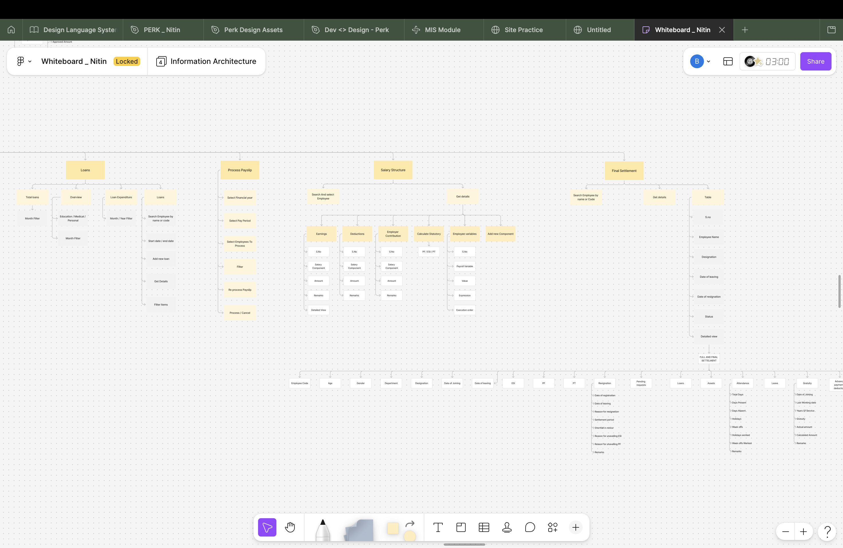
This led me to reframe the problem. Instead of improving individual screens, the focus shifted to making the product predictable, clear information architecture, scalable, and easier to navigate as a whole.
Misjudgment

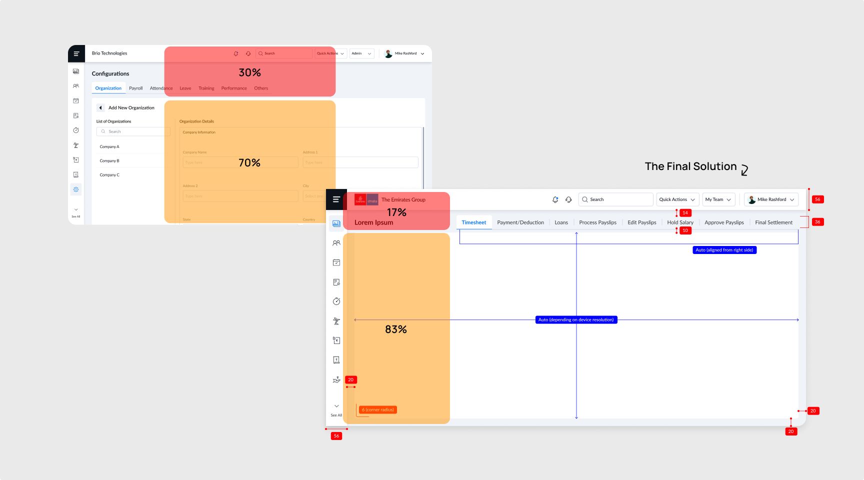
I did make a few misjudgments, but the good thing was that I tested an early prototype, which helped me identify and rectify them before development. One such issue was the secondary navigation placed below the page header, which appeared effective on larger screen like Macbook. However, prototype testing on lower height laptops such as Thinkpads revealed excessive vertical space consumption, reducing visible content area and increasing scroll dependency. I explored consolidating navigation into the left panel with expandable menus, but this introduced higher development effort and architectural constraints. The final solution restructured the navigation hierarchy by utilizing available horizontal space on the right side, improving content visibility without requiring a complete navigation overhaul.
Solution

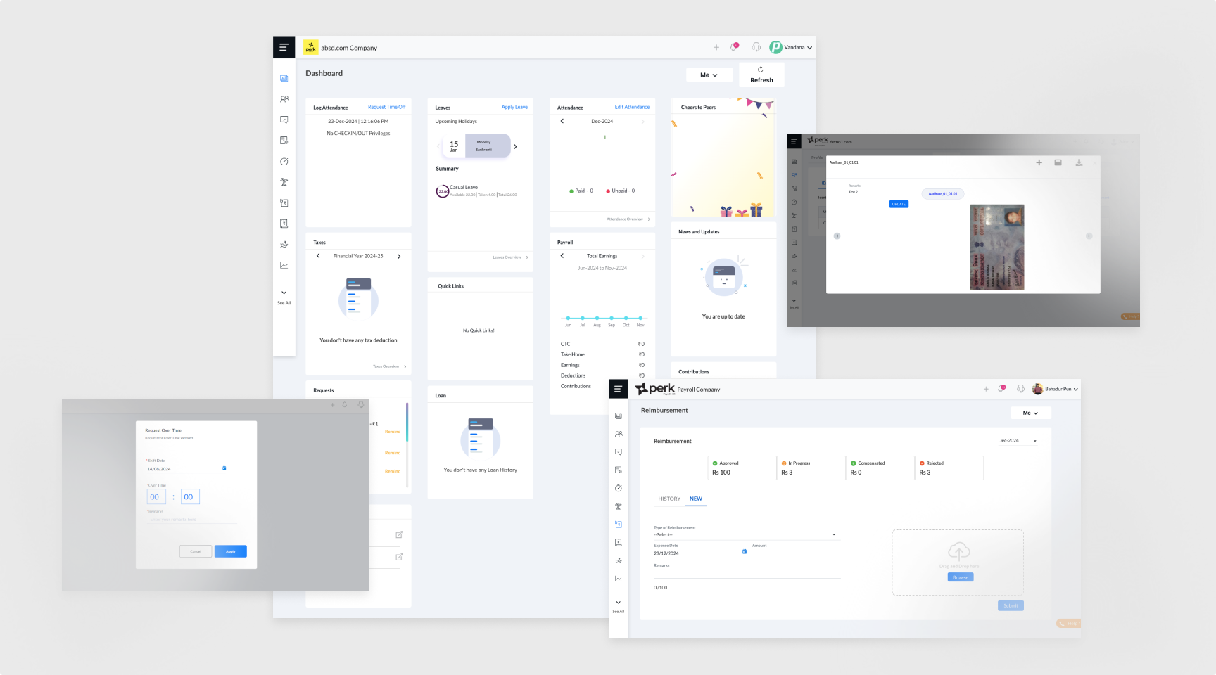
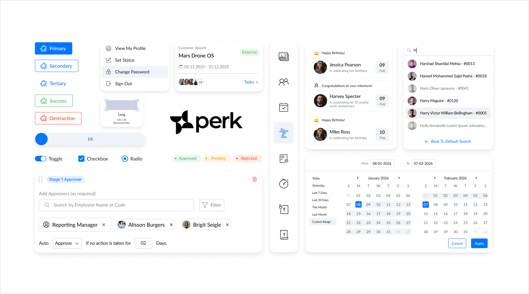
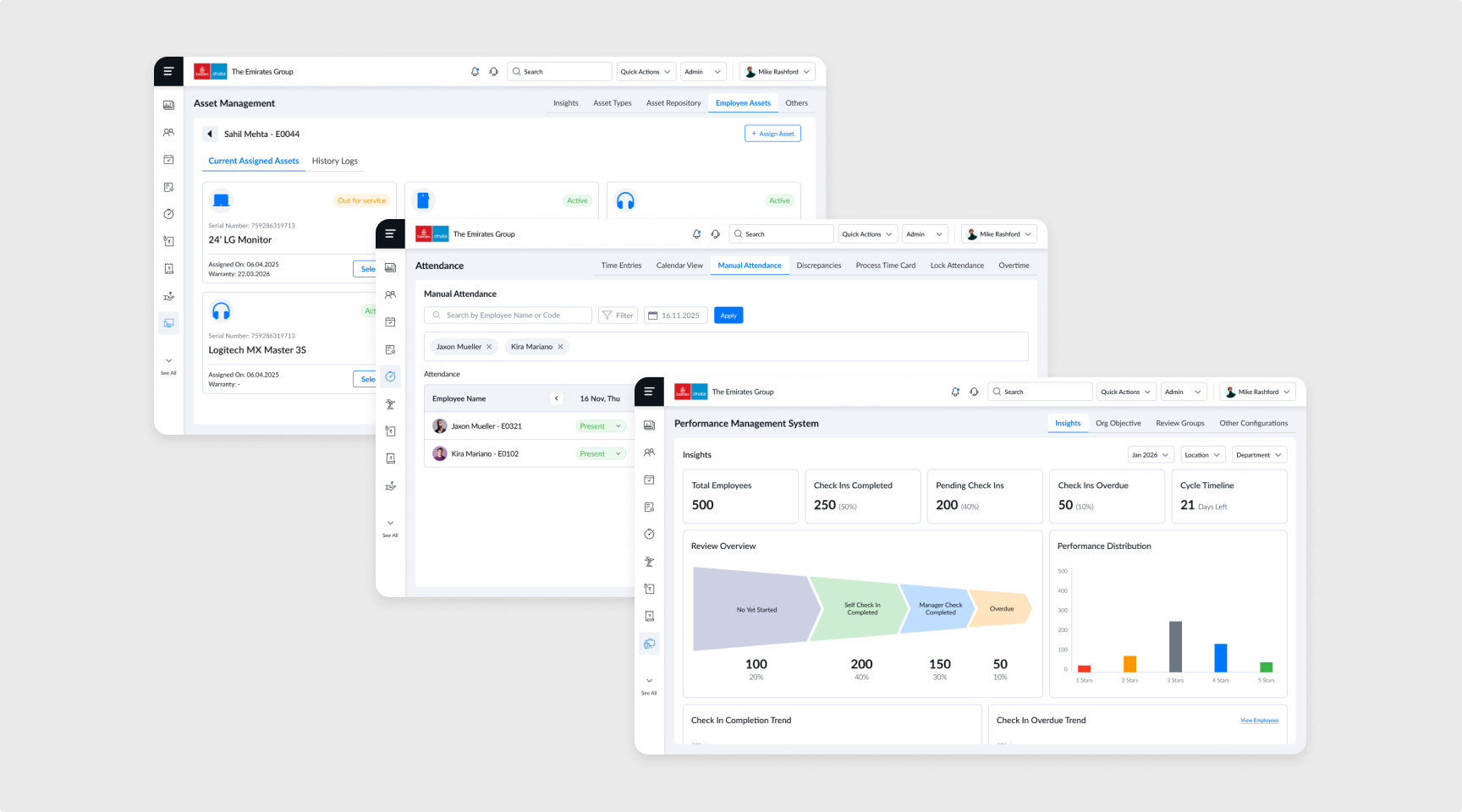
The solution centered on building a strong foundation through a design system and standardized workflows. I introduced consistent components, interaction patterns, and visual guidelines to unify the experience. Core workflows were redesigned to reduce friction and improve efficiency, while dashboards were restructured to prioritize relevant information and actions, enabling faster decision-making.
Making It Real

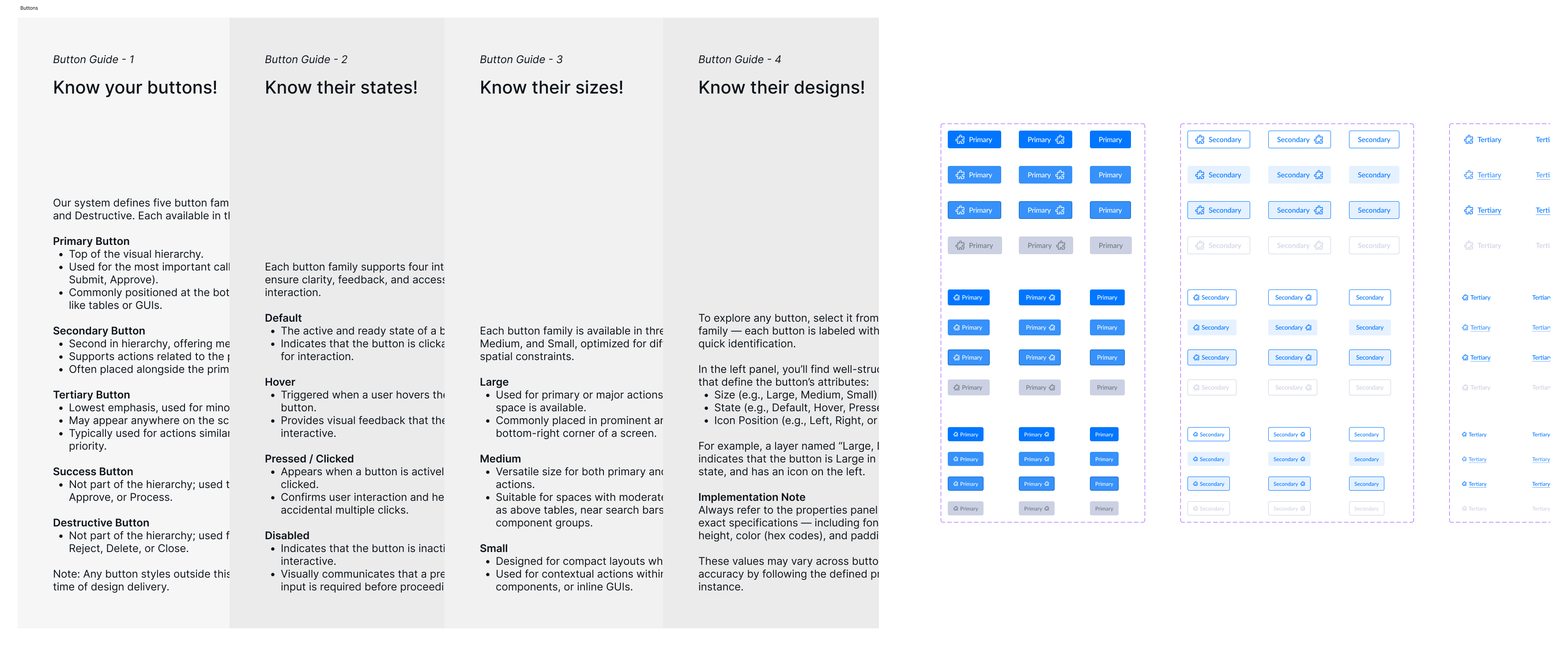
The challenge wasn’t just designing the solution, it was implementing it effectively. I worked closely with engineers to ensure the design system, workflows, and interaction patterns translated accurately into the product. To improve implementation consistency and future-proof the system, recently I also structured design tokens and variables using slash based hierarchical naming conventions (category/group/variant), making the system more scalable, maintainable, and better aligned for machine readability in emerging MCP and LLM-assisted workflows.
To drive adoption, I created clear documentation and conducted regular design reviews, ensuring consistency across releases. I also communicated the long-term value of these changes to stakeholders, aligning the effort with scalability, operational efficiency, and business impact rather than treating it as a purely visual redesign.
The Impact

The impact of these changes became visible within a few months. Task completion rates improved significantly, and users were able to navigate workflows with greater clarity and confidence. Drop offs reduced, and the dependency on support decreased noticeably as users began to rely more on the product itself. Additionally, component reuse across future modules, faster design handoff and more consistency in the product.
These improvements translated into measurable outcomes, including a 45% increase in task completion rate, a 20% reduction in workflow drop-offs, and a 25% decrease in support tickets in the first six months. Over time, the product also scaled more effectively, contributing to a 2.5x growth in clientele in the past one and half years.
What I Learnt

This experience fundamentally changed how I approach design. Designing for consistency and predictability is not just about aesthetics. It directly impacts how users think, behave, and trust a system. More importantly, I learned that strong design decisions need to be backed by measurable outcomes. Using tools like Azure Analytics and Pendo, I was able to track user behavior, validate improvements, and connect design changes to real impact.
Research References

Open to new challenges, let’s connect.


Transformed a Broken Experience into a Scalable HRMS
(Design System, Information Architecture, System Thinking, Primary & Secondary Research)
Overview

Most products fail loudly. This one didn’t.
Perk HRMS had features. It had clients. It worked. But underneath, something was off, users struggled to complete basic tasks, support tickets kept rising, and teams relied more on workarounds than the product itself.
That’s where I stepped in.
Context

I joined as the senior product designer on an HRMS platform used by multiple organizations to manage attendance, payroll, requests, and employee workflows.
On paper, the product was solid. In reality, it was functionally complete but experientially broken. Inconsistent UI, unpredictable flows, poor scalability and a lot of fiction points.
Diagnosis

The issues didn’t surface as isolated complaints. They showed up as patterns over time. HRs were taking longer to complete routine tasks, managers were avoiding certain workflows altogether, and employees depended heavily on HR instead of using the system independently.
Internally, support tickets were increasing, and each module behaved differently, creating confusion rather than clarity. It became evident that this wasn’t a UI issue—it was a deeper system failure.
Research

I conducted an agile UX audit across the product. I evaluated workflows, interaction patterns, and system consistency to understand what was actually breaking down.At this stage, the temptation was to fix visible issues quickly. But surface-level improvements would only mask deeper problems. I chose to focus on understanding user behavior and validating the patterns identified in the audit.
Over a span of a few weeks, I combined product analytics with user interviews across HRs, managers, and employees. This helped uncover where users dropped off, how they navigated workflows, and why they relied on support. In parallel, I did some secondary research to understand more about the competition and similar products in the market, their heuristic, patterns, pros and cons. Grounded the design system in established frameworks like Brad Frost’s Atomic Design, and studied mature systems such as Material Design 3, Salesforce Lightning Design System, and Uber Base Web to understand how large scale products structure components, tokens, and interaction patterns. Additionally, explored frontend frameworks like Bootstrap and Tailwind CSS to align design decisions with development constraints and improve implementation feasibility.
Reframe

The research validated a critical insight: the product wasn’t difficult because of its features, but because it lacked structure. Users were forced to relearn interactions across different modules, leading to confusion, inefficiency, and decision fatigue.
This led me to reframe the problem. Instead of improving individual screens, the focus shifted to making the product predictable, clear information architecture, scalable, and easier to navigate as a whole.
Misjudgment

I did make a few misjudgments, but the good thing was that I tested an early prototype, which helped me identify and rectify them before development. One such issue was the secondary navigation placed below the page header, which appeared effective on larger screen like Macbook. However, prototype testing on lower height laptops such as Thinkpads revealed excessive vertical space consumption, reducing visible content area and increasing scroll dependency. I explored consolidating navigation into the left panel with expandable menus, but this introduced higher development effort and architectural constraints. The final solution restructured the navigation hierarchy by utilizing available horizontal space on the right side, improving content visibility without requiring a complete navigation overhaul.
Solution

The solution centered on building a strong foundation through a design system and standardized workflows. I introduced consistent components, interaction patterns, and visual guidelines to unify the experience. Core workflows were redesigned to reduce friction and improve efficiency, while dashboards were restructured to prioritize relevant information and actions, enabling faster decision-making.
Making It Real

The challenge wasn’t just designing the solution, it was implementing it effectively. I worked closely with engineers to ensure that the design system and workflows were translated accurately into the product.
To drive adoption, I created clear documentation and conducted regular design reviews, ensuring consistency across releases. I also presented the long-term value of these changes to stakeholders, aligning the approach with scalability and business impact rather than just visual improvements.
The Impact

The impact of these changes became visible within a few months. Task completion rates improved significantly, and users were able to navigate workflows with greater clarity and confidence. Drop offs reduced, and the dependency on support decreased noticeably as users began to rely more on the product itself. Additionally, component reuse across future modules, faster design handoff and more consistency in the product.
These improvements translated into measurable outcomes, including a 45% increase in task completion rate, a 20% reduction in workflow drop-offs, and a 25% decrease in support tickets in the first six months. Over time, the product also scaled more effectively, contributing to a 2.5x growth in clientele in the past one and half years.
What I Learnt

This experience fundamentally changed how I approach design. Designing for consistency and predictability is not just about aesthetics. It directly impacts how users think, behave, and trust a system. More importantly, I learned that strong design decisions need to be backed by measurable outcomes. Using tools like Azure Analytics and Pendo, I was able to track user behavior, validate improvements, and connect design changes to real impact.
Research References

Open to new challenges, let’s connect.
Overview
Context
Diagnosis
Research
Reframe
Misjudgment
Solution
Making It Real
The Impact
What I Learnt
References

Transformed a Broken Experience into a Scalable HRMS
(Design System, Information Architecture, System Thinking, Primary & Secondary Research)
Overview

Most products fail loudly. This one didn’t.
Perk HRMS had features. It had clients. It worked. But underneath, something was off, users struggled to complete basic tasks, support tickets kept rising, and teams relied more on workarounds than the product itself.
That’s where I stepped in.
Context

I joined as the senior product designer on an HRMS platform used by multiple organizations to manage attendance, payroll, requests, and employee workflows.
On paper, the product was solid. In reality, it was functionally complete but experientially broken. Inconsistent UI, unpredictable flows, poor scalability and a lot of fiction points.
Diagnosis

The issues didn’t surface as isolated complaints. They showed up as patterns over time. HRs were taking longer to complete routine tasks, managers were avoiding certain workflows altogether, and employees depended heavily on HR instead of using the system independently.
Internally, support tickets were increasing, and each module behaved differently, creating confusion rather than clarity. It became evident that this wasn’t a UI issue—it was a deeper system failure.
Research

I conducted an agile UX audit across the product. I evaluated workflows, interaction patterns, and system consistency to understand what was actually breaking down.At this stage, the temptation was to fix visible issues quickly. But surface-level improvements would only mask deeper problems. I chose to focus on understanding user behavior and validating the patterns identified in the audit.
Over a span of a few weeks, I combined product analytics with user interviews across HRs, managers, and employees. This helped uncover where users dropped off, how they navigated workflows, and why they relied on support. In parallel, I did some secondary research to understand more about the competition and similar products in the market, their heuristic, patterns, pros and cons. Grounded the design system in established frameworks like Brad Frost’s Atomic Design, and studied mature systems such as Material Design 3, Salesforce Lightning Design System, and Uber Base Web to understand how large scale products structure components, tokens, and interaction patterns. Additionally, explored frontend frameworks like Bootstrap and Tailwind CSS to align design decisions with development constraints and improve implementation feasibility.
Reframe

The research validated a critical insight: the product wasn’t difficult because of its features, but because it lacked structure. Users were forced to relearn interactions across different modules, leading to confusion, inefficiency, and decision fatigue.
This led me to reframe the problem. Instead of improving individual screens, the focus shifted to making the product predictable, clear information architecture, scalable, and easier to navigate as a whole.
Misjudgment

I did make a few misjudgments, but the good thing was that I tested an early prototype, which helped me identify and rectify them before development. One such issue was the secondary navigation placed below the page header, which appeared effective on larger screen like Macbook. However, prototype testing on lower height laptops such as Thinkpads revealed excessive vertical space consumption, reducing visible content area and increasing scroll dependency. I explored consolidating navigation into the left panel with expandable menus, but this introduced higher development effort and architectural constraints. The final solution restructured the navigation hierarchy by utilizing available horizontal space on the right side, improving content visibility without requiring a complete navigation overhaul.
Solution

The solution centered on building a strong foundation through a design system and standardized workflows. I introduced consistent components, interaction patterns, and visual guidelines to unify the experience. Core workflows were redesigned to reduce friction and improve efficiency, while dashboards were restructured to prioritize relevant information and actions, enabling faster decision-making.
Making It Real

The challenge wasn’t just designing the solution, it was implementing it effectively. I worked closely with engineers to ensure the design system, workflows, and interaction patterns translated accurately into the product. To improve implementation consistency and future-proof the system, recently I also structured design tokens and variables using slash based hierarchical naming conventions (category/group/variant), making the system more scalable, maintainable, and better aligned for machine readability in emerging MCP and LLM-assisted workflows.
To drive adoption, I created clear documentation and conducted regular design reviews, ensuring consistency across releases. I also communicated the long-term value of these changes to stakeholders, aligning the effort with scalability, operational efficiency, and business impact rather than treating it as a purely visual redesign.
The Impact

The impact of these changes became visible within a few months. Task completion rates improved significantly, and users were able to navigate workflows with greater clarity and confidence. Drop offs reduced, and the dependency on support decreased noticeably as users began to rely more on the product itself. Additionally, component reuse across future modules, faster design handoff and more consistency in the product.
These improvements translated into measurable outcomes, including a 45% increase in task completion rate, a 20% reduction in workflow drop-offs, and a 25% decrease in support tickets in the first six months. Over time, the product also scaled more effectively, contributing to a 2.5x growth in clientele in the past one and half years.
What I Learnt

This experience fundamentally changed how I approach design. Designing for consistency and predictability is not just about aesthetics and more about systems. It directly impacts how users think, behave, and trust a product. More importantly, I learned that strong design decisions need to be backed by measurable outcomes. Using tools like Azure Analytics and Pendo, I was able to track user behavior, validate improvements, and connect design changes to real impact.
Research References

Open to new challenges, let’s connect.


