

back
Designing a Multi-Channel Ordering Experience for ChaatRaja
(Product strategy, Stakeholder Collaboration, UX research, Interaction Design)
Overview

Chart Raja started as a seemingly straightforward food ordering application, but the physical outlet made the problem much more complex. Customers could order for delivery, walk in to collect pre-orders, or use a drive-in experience, while staff had to manage all three alongside their existing billing and accounting processes. I designed the customer app and operational backend by first understanding the real-world service, then connecting these digital and physical touchpoints into one coherent system.
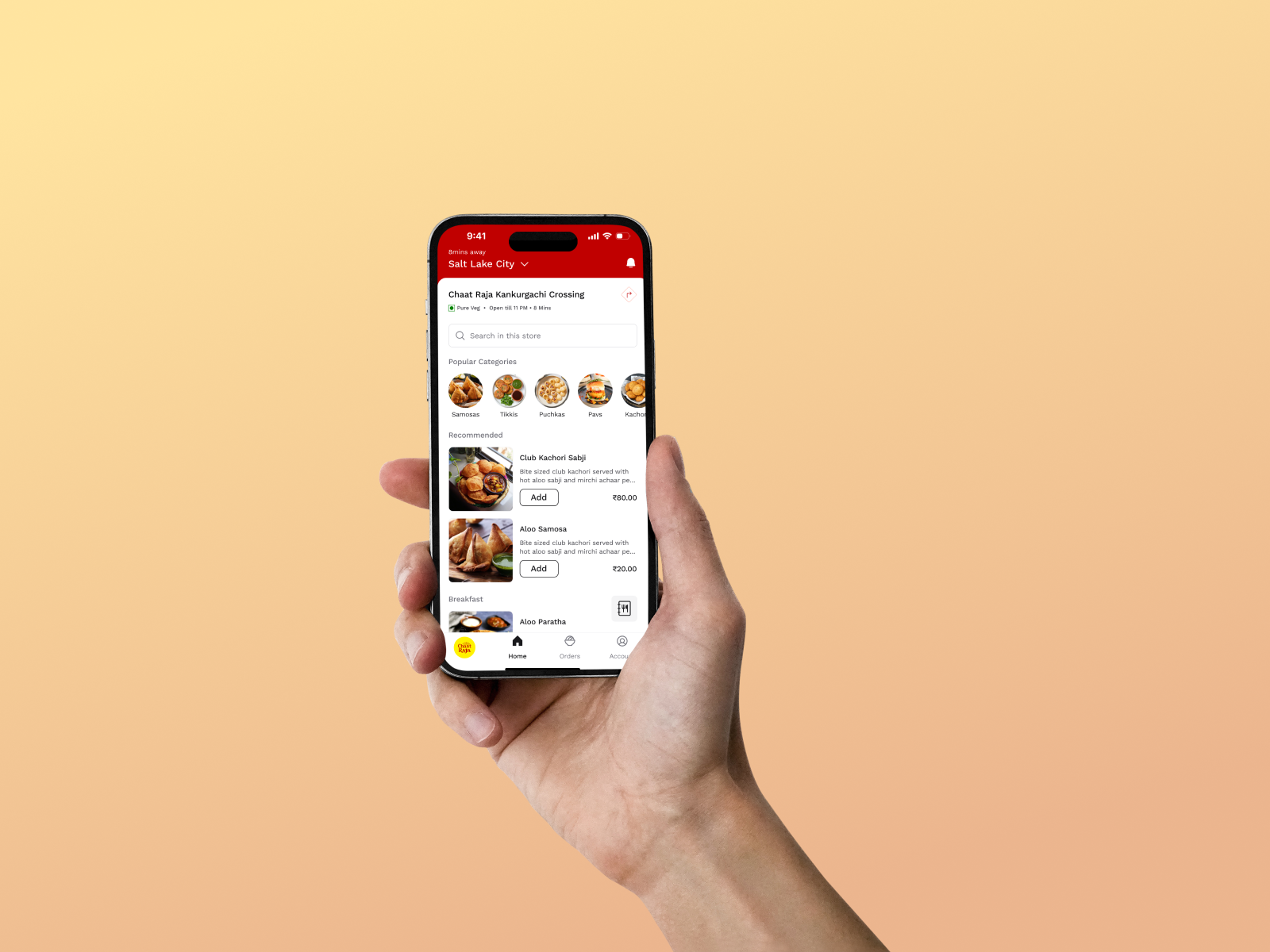
The Challenge

The challenge wasn't simply designing another food ordering app. The business already had an established physical operation, where receptionists, accountants, kitchen staff, delivery executives, and customers interacted with different parts of the same service.
The product therefore had to support three different fulfillment models without making the experience feel fragmented. At the same time, it needed to work alongside the existing POS setup rather than forcing the business to completely change how it operated.
Diagnosis Before Design

I started by stepping away from the screens and understanding what actually happened inside the outlet.
I spoke with the stakeholders, visited the store, and spent time understanding the day-to-day activities of the receptionist and accountant. This helped me identify where orders originated, how they were processed, how billing happened, and where the physical and digital workflows intersected.
One thing became clear early: the product wasn't just an ordering app. It was a service ecosystem connecting customers, store operations, billing, and fulfillment.
Research

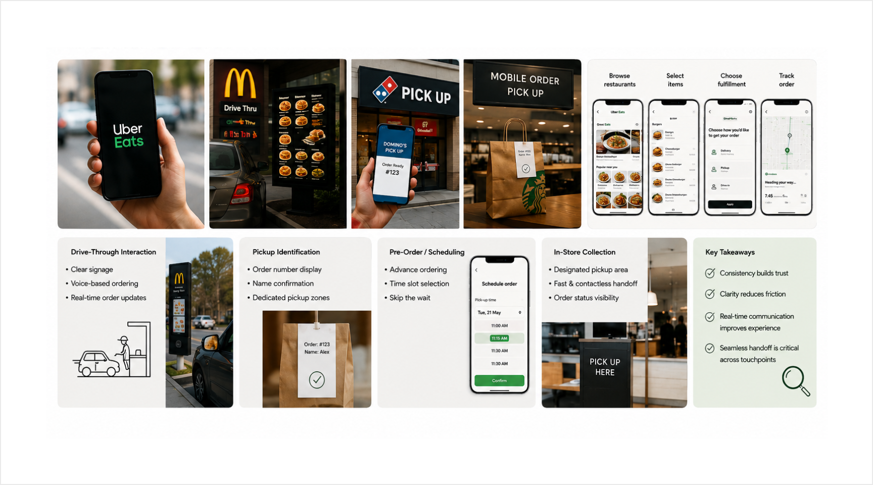
For the customer-facing experience, I studied existing food ordering applications because users already had established expectations around browsing, ordering, payments, and tracking.
The more interesting research was around pickup and drive-in. I looked at experiences from brands such as McDonald's, Domino's, and Starbucks to understand how pre-orders, pickup identification, drive-through interactions, and physical collection were handled.
I also investigated how the existing POS system would interact with the new product, particularly around billing and accounting, because a good experience would be meaningless if it created operational friction behind the scenes.
Synthesis

I brought the research together into the information architecture and mapped the product around three primary journeys:
Delivery | Walk-in | Drive-in
The ordering foundation could remain familiar across all three, but the fulfillment experience needed to change depending on how the customer intended to receive the order.
For delivery, the system needed to handle assignment and tracking. For walk-in and drive-in, the customer had already placed the order and simply needed a reliable way to identify and collect it.
This became the foundation for the overall product architecture.
Interaction Design

Once the architecture was established, I focused heavily on interaction patterns and user mental models.
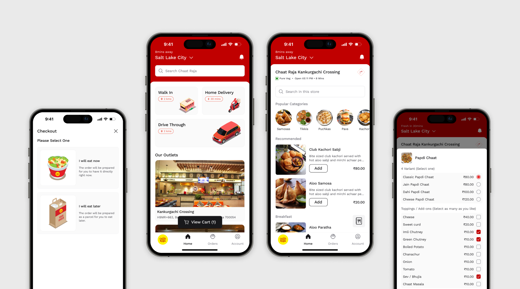
After a few prototype rounds, I observed how users interacted with familiar food ordering applications and identified patterns they already understood. I iterated on navigation, hierarchy, and key interactions so users could rely on existing behaviors instead of learning a completely new system.
This also helped me establish a consistent navigation model and overall app architecture. Delivery, walk-in, and drive-in needed to feel like parts of the same product, while still making their differences obvious at the right moments.
Solution

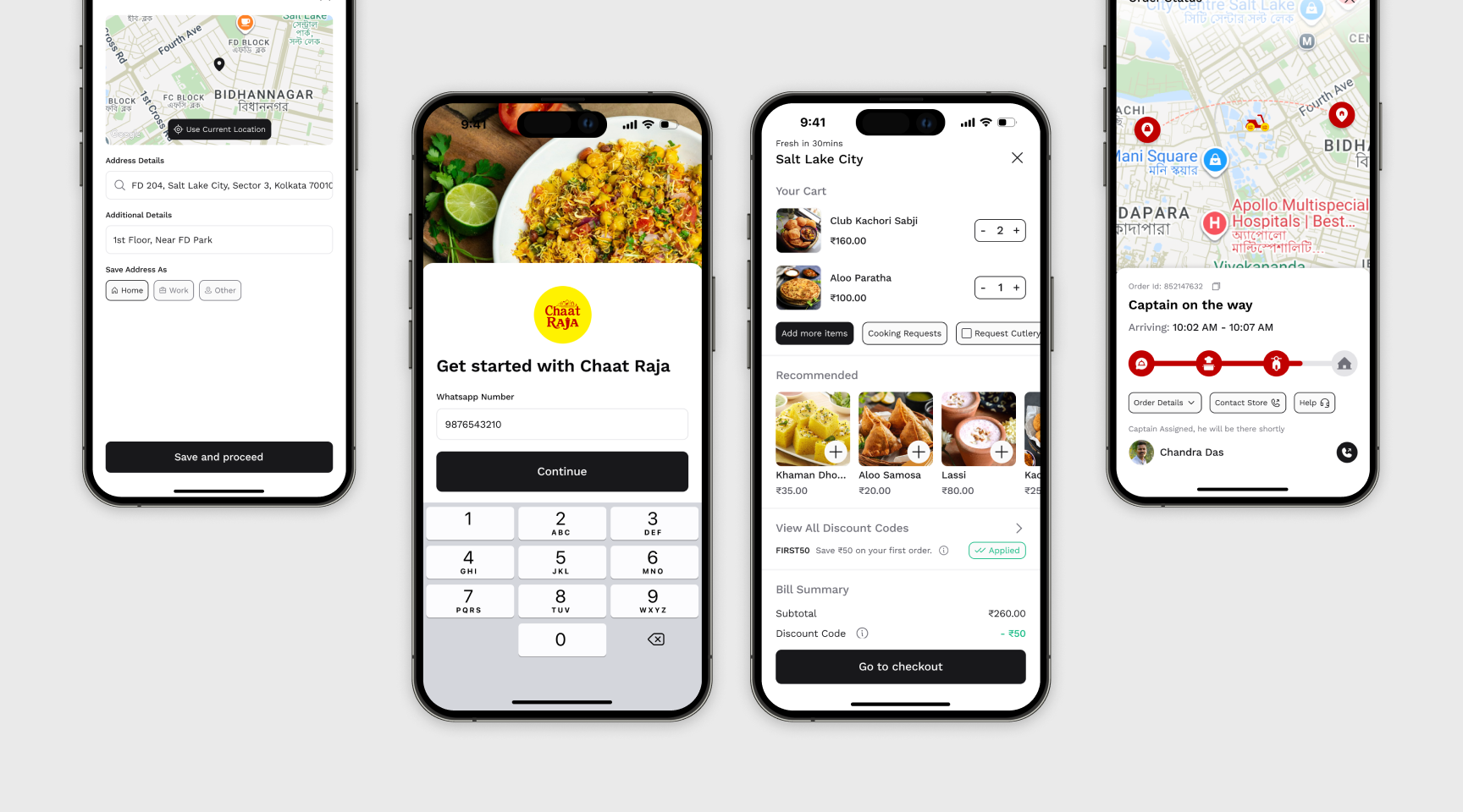
For delivery, the experience followed a familiar food ordering journey, with the additional operational layer required for fulfillment.
For walk-in and drive-in, I introduced a token/OTP based pickup experience. Customers could place their order in advance, arrive at the outlet, present their token, and collect their prepared food without having to repeat the ordering process.
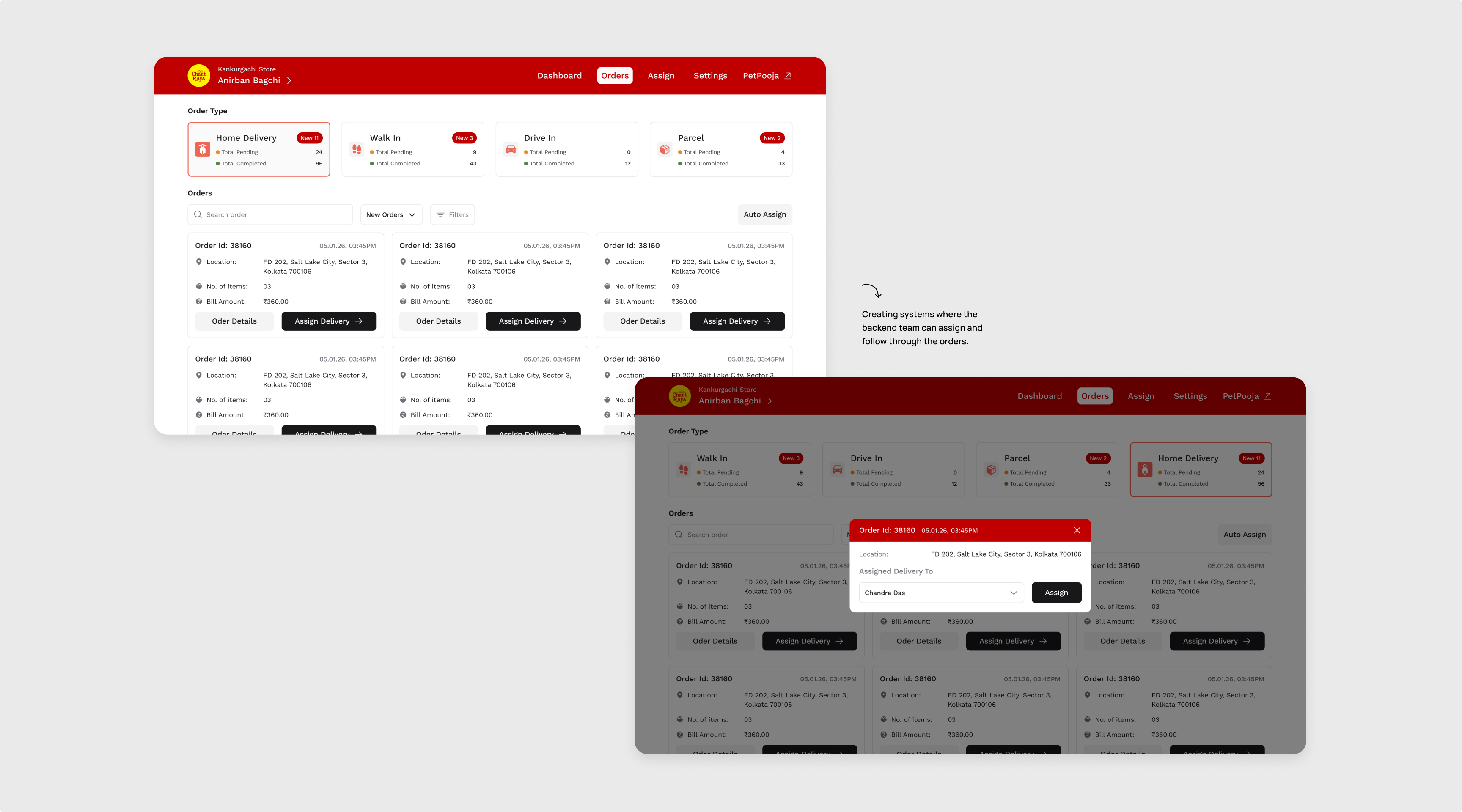
The backend connected these experiences by allowing staff to distinguish between delivery, walk-in, and drive-in orders and manage them according to their fulfillment requirements.
For delivery orders, the system could assign a delivery executive and provide them with a dedicated delivery link through WhatsApp. The executive could access the destination, collect an OTP from the customer, and mark the delivery as completed.
This created a connected journey from order → preparation → assignment → fulfilment → verification.
Iteration & Validation

The first version wasn't perfect, and I didn't expect it to be.
I created prototypes for the individual journeys, tested them with users, identified areas where interactions weren't immediately clear, and iterated. Once the individual flows became solid, I brought them together into a larger prototype and tested the complete experience again.
The feedback helped refine navigation, pickup interactions, and the relationship between different fulfillment states before we moved towards the final design.
Collaboration

This project involved constant collaboration with stakeholders, store staff, users, and developers.
A major part of my role was translating what I observed in the physical store into digital product requirements, while also understanding technical constraints and existing system integrations.
The integration was particularly important because the new product had to fit into an existing operational ecosystem of PetPooja rather than operate as a standalone application.
The final solution therefore came through several rounds of discussion, validation, and iteration rather than a single design handoff.
The Impact

The product is now live on the App Store and Play Store and has seen good adoption since launch.
Customers are actively using the application for food ordering, including delivery and drive-in experiences. Product analytics also showed adoption across these different journeys, giving us evidence that the system was successfully supporting the different fulfillment models we designed for.
More importantly, the product has been in real-world use, where the customer experience and the operational backend work together as one service.
What I Learnt
Chart Raja taught me that designing a product for a physical business requires looking far beyond the interface.
The most valuable part wasn't designing the food ordering screens. It was understanding the service behind the screen: how customers behave, how staff operate, how existing systems communicate, and where digital interactions meet physical ones.
It reinforced something I now carry into my other projects: before designing the interface, understand the system the interface has to live within.
Open to new challenges, let’s connect.


Designing a Multi-Channel Ordering Experience for ChaatRaja
(Product strategy, Stakeholder Collaboration, UX research, Interaction Design)
Overview

Chart Raja started as a seemingly straightforward food ordering application, but the physical outlet made the problem much more complex. Customers could order for delivery, walk in to collect pre-orders, or use a drive-in experience, while staff had to manage all three alongside their existing billing and accounting processes. I designed the customer app and operational backend by first understanding the real-world service, then connecting these digital and physical touchpoints into one coherent system.
The Challenge

The challenge wasn't simply designing another food ordering app. The business already had an established physical operation, where receptionists, accountants, kitchen staff, delivery executives, and customers interacted with different parts of the same service.
The product therefore had to support three different fulfillment models without making the experience feel fragmented. At the same time, it needed to work alongside the existing POS setup rather than forcing the business to completely change how it operated.
Diagnosis Before Design

I started by stepping away from the screens and understanding what actually happened inside the outlet.
I spoke with the stakeholders, visited the store, and spent time understanding the day-to-day activities of the receptionist and accountant. This helped me identify where orders originated, how they were processed, how billing happened, and where the physical and digital workflows intersected.
One thing became clear early: the product wasn't just an ordering app. It was a service ecosystem connecting customers, store operations, billing, and fulfillment.
Research

For the customer-facing experience, I studied existing food ordering applications because users already had established expectations around browsing, ordering, payments, and tracking.
The more interesting research was around pickup and drive-in. I looked at experiences from brands such as McDonald's, Domino's, and Starbucks to understand how pre-orders, pickup identification, drive-through interactions, and physical collection were handled.
I also investigated how the existing POS system would interact with the new product, particularly around billing and accounting, because a good experience would be meaningless if it created operational friction behind the scenes.
Synthesis

I brought the research together into the information architecture and mapped the product around three primary journeys:
Delivery | Walk-in | Drive-in
The ordering foundation could remain familiar across all three, but the fulfillment experience needed to change depending on how the customer intended to receive the order.
For delivery, the system needed to handle assignment and tracking. For walk-in and drive-in, the customer had already placed the order and simply needed a reliable way to identify and collect it.
This became the foundation for the overall product architecture.
Interaction Design

Once the architecture was established, I focused heavily on interaction patterns and user mental models.
After a few prototype rounds, I observed how users interacted with familiar food ordering applications and identified patterns they already understood. I iterated on navigation, hierarchy, and key interactions so users could rely on existing behaviors instead of learning a completely new system.
This also helped me establish a consistent navigation model and overall app architecture. Delivery, walk-in, and drive-in needed to feel like parts of the same product, while still making their differences obvious at the right moments.
Solution

For delivery, the experience followed a familiar food ordering journey, with the additional operational layer required for fulfillment.
For walk-in and drive-in, I introduced a token/OTP based pickup experience. Customers could place their order in advance, arrive at the outlet, present their token, and collect their prepared food without having to repeat the ordering process.
The backend connected these experiences by allowing staff to distinguish between delivery, walk-in, and drive-in orders and manage them according to their fulfillment requirements.
For delivery orders, the system could assign a delivery executive and provide them with a dedicated delivery link through WhatsApp. The executive could access the destination, collect an OTP from the customer, and mark the delivery as completed.
This created a connected journey from order → preparation → assignment → fulfilment → verification.
Iteration & Validation

The first version wasn't perfect, and I didn't expect it to be.
I created prototypes for the individual journeys, tested them with users, identified areas where interactions weren't immediately clear, and iterated. Once the individual flows became solid, I brought them together into a larger prototype and tested the complete experience again.
The feedback helped refine navigation, pickup interactions, and the relationship between different fulfillment states before we moved towards the final design.
Collaboration

This project involved constant collaboration with stakeholders, store staff, users, and developers.
A major part of my role was translating what I observed in the physical store into digital product requirements, while also understanding technical constraints and existing system integrations.
The integration was particularly important because the new product had to fit into an existing operational ecosystem of PetPooja rather than operate as a standalone application.
The final solution therefore came through several rounds of discussion, validation, and iteration rather than a single design handoff.
The Impact

The product is now live on the App Store and Play Store and has seen good adoption since launch.
Customers are actively using the application for food ordering, including delivery and drive-in experiences. Product analytics also showed adoption across these different journeys, giving us evidence that the system was successfully supporting the different fulfillment models we designed for.
More importantly, the product has been in real-world use, where the customer experience and the operational backend work together as one service.
What I Learnt
Chart Raja taught me that designing a product for a physical business requires looking far beyond the interface.
The most valuable part wasn't designing the food ordering screens. It was understanding the service behind the screen: how customers behave, how staff operate, how existing systems communicate, and where digital interactions meet physical ones.
It reinforced something I now carry into my other projects: before designing the interface, understand the system the interface has to live within.
Open to new challenges, let’s connect.

Overview
Challenge
Alignment
Constraint
Research
Interaction
Solution
Iterations
Collaborations
The Impact
What I Learnt

Designing a Multi-Channel Ordering Experience for ChaatRaja
(Product strategy, Stakeholder Collaboration, UX research, Interaction Design)
Overview

Chart Raja started as a seemingly straightforward food ordering application, but the physical outlet made the problem much more complex. Customers could order for delivery, walk in to collect pre-orders, or use a drive-in experience, while staff had to manage all three alongside their existing billing and accounting processes. I designed the customer app and operational backend by first understanding the real-world service, then connecting these digital and physical touchpoints into one coherent system.
The Challenge

The challenge wasn't simply designing another food ordering app. The business already had an established physical operation, where receptionists, accountants, kitchen staff, delivery executives, and customers interacted with different parts of the same service.
The product therefore had to support three different fulfillment models without making the experience feel fragmented. At the same time, it needed to work alongside the existing POS setup rather than forcing the business to completely change how it operated.
Diagnosis Before Design

I started by stepping away from the screens and understanding what actually happened inside the outlet.
I spoke with the stakeholders, visited the store, and spent time understanding the day-to-day activities of the receptionist and accountant. This helped me identify where orders originated, how they were processed, how billing happened, and where the physical and digital workflows intersected.
One thing became clear early: the product wasn't just an ordering app. It was a service ecosystem connecting customers, store operations, billing, and fulfillment.
Research

For the customer-facing experience, I studied existing food ordering applications because users already had established expectations around browsing, ordering, payments, and tracking.
The more interesting research was around pickup and drive-in. I looked at experiences from brands such as McDonald's, Domino's, and Starbucks to understand how pre-orders, pickup identification, drive-through interactions, and physical collection were handled.
I also investigated how the existing POS system would interact with the new product, particularly around billing and accounting, because a good experience would be meaningless if it created operational friction behind the scenes.
Synthesis

I brought the research together into the information architecture and mapped the product around three primary journeys:
Delivery | Walk-in | Drive-in
The ordering foundation could remain familiar across all three, but the fulfillment experience needed to change depending on how the customer intended to receive the order.
For delivery, the system needed to handle assignment and tracking. For walk-in and drive-in, the customer had already placed the order and simply needed a reliable way to identify and collect it.
This became the foundation for the overall product architecture.
Interaction Design

Once the architecture was established, I focused heavily on interaction patterns and user mental models.
After a few prototype rounds, I observed how users interacted with familiar food ordering applications and identified patterns they already understood. I iterated on navigation, hierarchy, and key interactions so users could rely on existing behaviors instead of learning a completely new system.
This also helped me establish a consistent navigation model and overall app architecture. Delivery, walk-in, and drive-in needed to feel like parts of the same product, while still making their differences obvious at the right moments.
Solution

For delivery, the experience followed a familiar food ordering journey, with the additional operational layer required for fulfillment.
For walk-in and drive-in, I introduced a token/OTP based pickup experience. Customers could place their order in advance, arrive at the outlet, present their token, and collect their prepared food without having to repeat the ordering process.
The backend connected these experiences by allowing staff to distinguish between delivery, walk-in, and drive-in orders and manage them according to their fulfillment requirements.
For delivery orders, the system could assign a delivery executive and provide them with a dedicated delivery link through WhatsApp. The executive could access the destination, collect an OTP from the customer, and mark the delivery as completed.
This created a connected journey from order → preparation → assignment → fulfilment → verification.
Iteration & Validation

The first version wasn't perfect, and I didn't expect it to be.
I created prototypes for the individual journeys, tested them with users, identified areas where interactions weren't immediately clear, and iterated. Once the individual flows became solid, I brought them together into a larger prototype and tested the complete experience again.
The feedback helped refine navigation, pickup interactions, and the relationship between different fulfillment states before we moved towards the final design.
Collaboration

This project involved constant collaboration with stakeholders, store staff, users, and developers.
A major part of my role was translating what I observed in the physical store into digital product requirements, while also understanding technical constraints and existing system integrations.
The integration was particularly important because the new product had to fit into an existing operational ecosystem of PetPooja rather than operate as a standalone application.
The final solution therefore came through several rounds of discussion, validation, and iteration rather than a single design handoff.
The Impact

The product is now live on the App Store and Play Store and has seen good adoption since launch.
Customers are actively using the application for food ordering, including delivery and drive-in experiences. Product analytics also showed adoption across these different journeys, giving us evidence that the system was successfully supporting the different fulfillment models we designed for.
More importantly, the product has been in real-world use, where the customer experience and the operational backend work together as one service.
What I Learnt
Chart Raja taught me that designing a product for a physical business requires looking far beyond the interface.
The most valuable part wasn't designing the food ordering screens. It was understanding the service behind the screen: how customers behave, how staff operate, how existing systems communicate, and where digital interactions meet physical ones.
It reinforced something I now carry into my other projects: before designing the interface, understand the system the interface has to live within.
Open to new challenges, let’s connect.


